The history of art is constantly evolving. In reality, old styles tend to resurface over time. Contemporary design tends to bring classic ideals back to the forefront, and one example is the Baroque-style design. This style, which emerged in Europe between the 17th and early 19th centuries, is well-known for its luxury, intricate details, and visual dramatization.
In the 20th and 21st centuries, the demand for reliving the classic beauty has been rising significantly. The Neo-Baroque design style appears as a renewal of the Baroque aesthetic with a more modern approach. People not only view this style as a historical relic, but it also evolves into an artistic and relevant strategy to meet today’s visual needs. In the graphic design world, the Neo-Baroque design style comes with decorative typography, detailed frames, and dramatic layouts with high contrast.
In the context of Neo-Baroque, typography plays an important role in enhancing the aesthetic impression. The selection of the right font can evoke a classic yet modern feel, thereby supporting the creation of luxurious and dramatic designs. This article will discuss 20 fonts that are ideal for applying to the Neo-Baroque design style in your work.
Table of Contents
20 Fonts for Captivating Neo-Baroque Design Style
Imagine letters that not only can you read but also feel the dramatic nuance of the glorious Baroque-style era. Well, these are fonts that can evoke that exact feeling and are worth using, especially for your Neo-Baroque design style.
Warm Curves
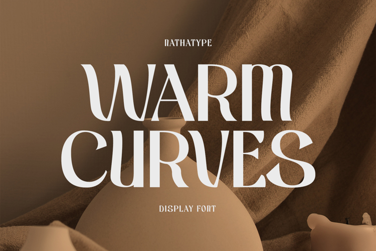
Introducing Warm Curves, a modern serif font with elegant style, graceful curves, and high readability. The character of this font shows a thick accent on the edge of the letters, making it visually strong and delivering the message well. This font not only serves as a decorative element but also as a functional typographic medium to translate the spirit of the Neo-Baroque design style into modern design. By elegantly presenting characteristic Baroque ornaments, Warm Curves builds a theatrical visual narrative without compromising readability and is flexible for use in poster titles, magazines, logos, and social media.
Lorcati
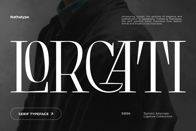
Next is Lorcati. This is a serif font with elegant, solid, and neatly organized vibes. It has a capital format, smooth and proportional strokes, and lines with high contrast. Albeit looking light, this font exudes a wonderful visual appeal and strong character. When applied in the Neo-Baroque design style, Lorcati can give a sharp serif look with balanced proportions, making it look luxurious without being too much. Lorcati is perfect for creating logos, fashion designs, headlines, and various media with a theatrical vibe. One thing is for sure: Lorcati maintains its gracefulness and high readability.
Neolost
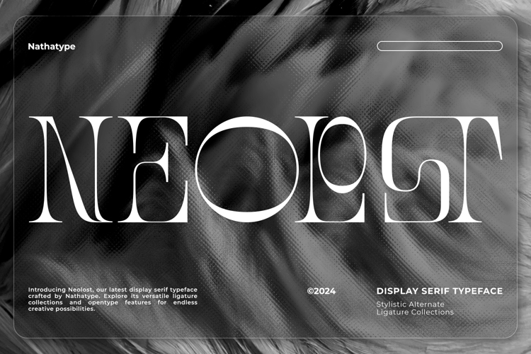
Introducing Neolost, a striking serif font that captivates with its uppercase characters and an impressive range of nine thickness levels, from delicate thin to bold black. Certain letters feature broken lines, while nearly all possess a distinctive contrast that evokes a wavy, edgy, and captivating impression. This nuance resonates with the Neo-Baroque design style, showcasing modern visual decorations that take the place of classic carving elements. Neolost is perfect for captivating poster titles, stunning fashion magazine covers, elegant logos, and exquisite packaging.
Star Castle
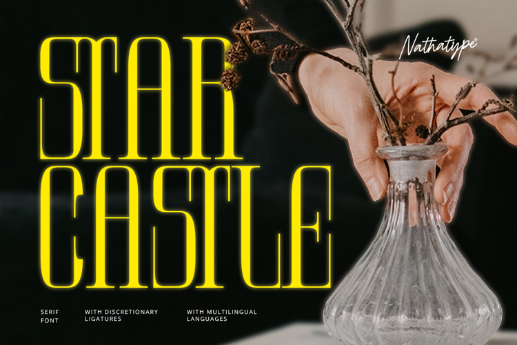
Star Castle is a serif display font that combines luxury with a contemporary feel. Its character features a bold contrast between thick and thin strokes with tall forms and a square structure, which strengthens the font’s characteristics while creating a unique visual identity. This font is ideal as a visual focus element, especially for headlines, with a modern sans-serif font pairing. In the context of the Neo-Baroque design style, Star Castle conveys a bold, dramatic, and elegant impression, making it suitable for poster headlines, magazine covers, and luxury product logos.
Kingdom Ink
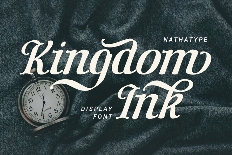
Kingdom Ink is an artistic calligraphy-style display font featuring letters that resemble thick ink strokes. This font blends classic nuances with contemporary elements, creating a bold, theatrical, and characterful visual identity through dynamic brush strokes with varying line thicknesses. In the context of the Neo-Baroque design style, Kingdom Ink is able to bring back the spirit of drama, luxury, and typical Baroque ornamentation, making it ideal for logos or visual identities that highlight exclusivity and a modern classic feel.
Myflora
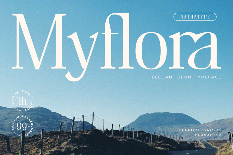
Myflora is a serif font that combines classic typography with an organic touch through soft curved elements in the lowercase. The variation in line thickness creates a dramatic visual rhythm that is both elegant and natural. In the Neo-Baroque design style, Myflora serves as a bridge between the decorative beauty of Baroque and contemporary nuances, making it ideal for headlines, main titles, and decorative elements on posters, apparel designs, or brand identities that aim to convey an exclusive impression.
Reline Rosery
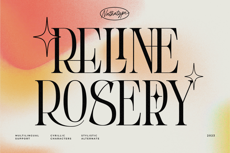
Reline Rosery is a decorative serif font that exudes elegance through its richly detailed typography. This font combines the beauty of classic serifs with subtle artistic touches to create a luxurious atmosphere. In the realm of Neo-Baroque design styles, every decorative detail of this font serves to replace traditional carved elements and convey a sense of grandeur without appearing outdated. Reline Rosery is relevant in the Neo-Baroque design style because it can revive the spirit of drama, luxury, and the complexity of typical Baroque ornaments. It is ideal for use as a headline on contemporary posters, luxury branding logos, or magazine covers with a dramatic theme.
Mergury
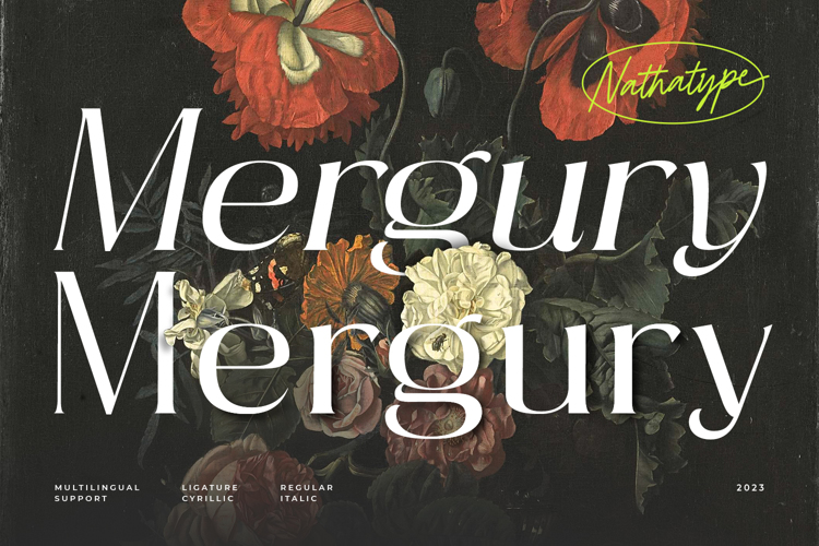
Mergury is a serif font designed with a blend of classic and modern styles. The design features a traditional serif aesthetic enriched with delicate decorative details, creating a distinctive and elegant impression. This font has characters with strong thick-thin contrast, soft serifs, and a sturdy structure that makes it appear dignified. In the Neo-Baroque design style, Mergury is able to reinterpret the spirit of typical Baroque grandeur through a modern approach. This font is ideal for use in poster headlines, luxury branding logos, apparel design, and magazine covers.
Prosper Rules
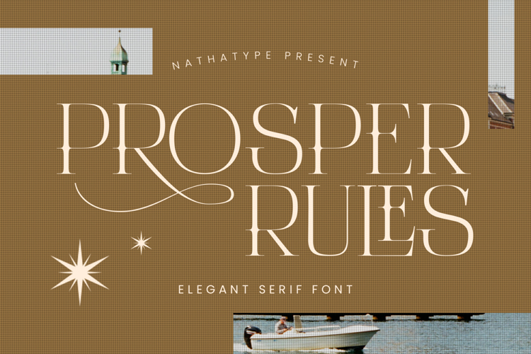
Prosper Rules is a luxurious decorative serif font that combines classic structure with detailed artistic elements, resulting in characterful typography. Its character features soft curves, proportional line thickness contrast, and subtle accents resembling classic motifs. In the context of the Neo-Baroque design style, Prosper Rules is able to evoke a sense of drama and grandeur through typographic ornaments that serve as a substitute for traditional details, yet remain modern and relevant. Its application is ideal for art show headlines, magazine covers, and luxurious event invitations that demand a grand impression.
Raina
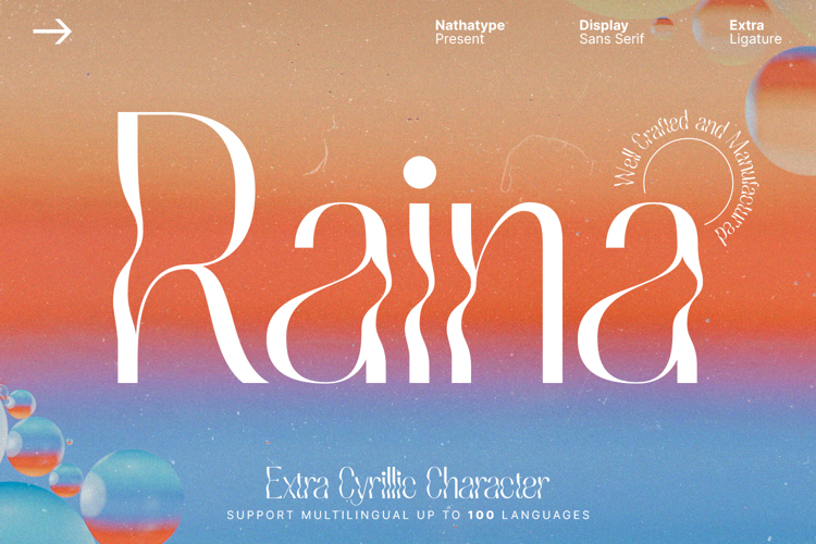
Raina is an elegant decorative sans-serif that combines the strength of classic typography with a contemporary touch. The design features thick-thin contrast, long, slender letterforms, and smooth curves with decorative details, creating a dramatic and unique impression. In the context of the Neo-Baroque design style, Raina can reinterpret the grand, theatrical, and elegant atmosphere typical of Baroque with a modern approach. This font is ideal for poster headlines, luxury branding logos, fashion magazine covers, apparel design, and visual identities that emphasise exclusivity.
Marlino
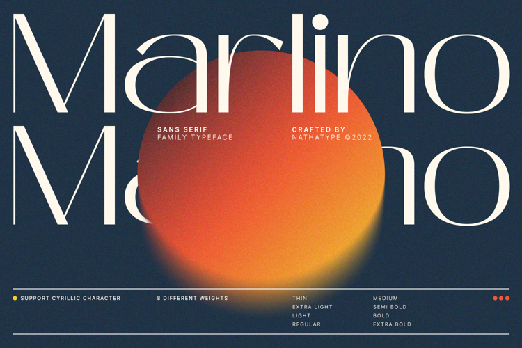
Marlino is an elegant sans-serif font that combines the strength of classic typography with a modern touch. Its character is marked by a clear thick-thin contrast, letterforms that tend towards square shapes with a robust structure, and soft curves that convey an elegant impression. In the Neo-Baroque design style, Marlino manages to capture the grandeur and theatricality characteristic of Baroque through simple decorative details that replace intricate ornamentation. This font is ideal for poster headlines, luxury branding logos, event invitations with an elegant theme, and magazine covers with an exclusive feel.
Rasfire
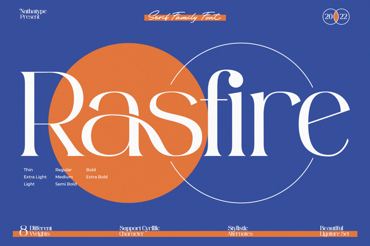
Rasfire is a serif font designed with a luxurious and theatrical feel. This font has distinctive characteristics, including sharp thick-thin contrast, sturdy letterforms, and decorative details in its stylistic alternates and ligatures. In the context of the Neo-Baroque design style, Rasfire plays a role in bringing back a luxurious atmosphere by maximising the use of its alternates and ligatures, which have decorative elements with an elegant and more modern feel. Rasfire is ideal for use in poster headlines, branding logos, and visual identities that emphasise an elegant and exclusive image.
Refinest
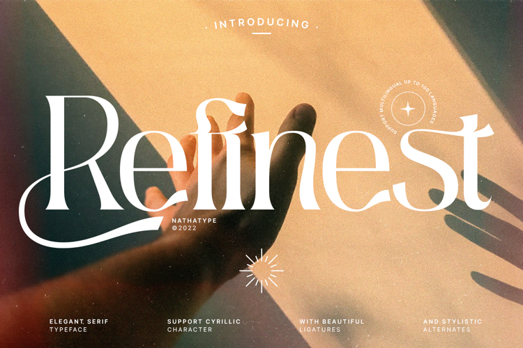
Refinest is a serif font that blends classic aesthetics with a contemporary touch. Its character features a clear thick-thin contrast, proportional letterforms, and delicate details at the ends of some letters that resemble classical carvings. With its graceful curves and balanced proportions, this font is ideal for the Neo-Baroque design style, particularly for poster headlines, branding logos, and elegant event invitations.
Cagier
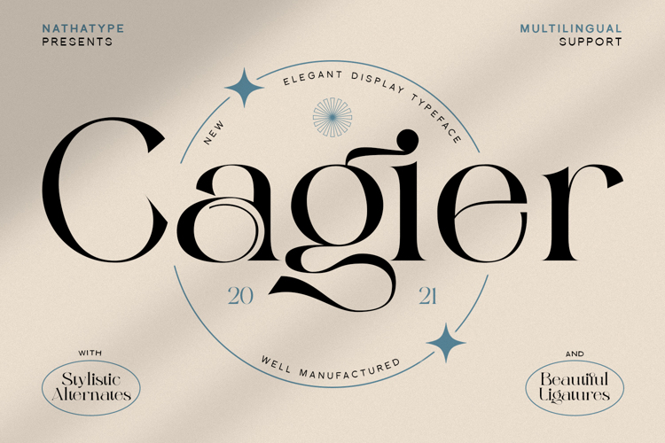
Are you looking for a serif that combines a classic vibe with modern details? Then, you need to try Cagier. This font offers a fresh interpretation of visual luxury. Its character is marked by strong thick-thin contrast, a slender form with a sturdy structure, and decorative details in the form of soft curves in some of its letters. In the Neo-Baroque design style, Cagier is perfect for large headlines, premium visual identities, and creative media that demand an elegant impression.
Renneal
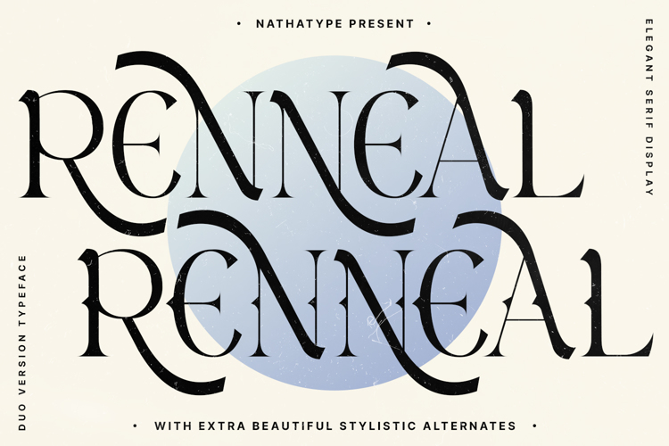
Renneal is a font with two main styles: serif and display. The serif version of Renneal features distinctive curves and cleaner details in each letter, while the display version has decorative details in the middle of the letters, making it more characterful. This font has a strong character through clear visual contrast, balanced proportions, and full feature support. In the context of the Neo-Baroque design style, Renneal played a role in translating Baroque luxury into a modern format. These advantages make it ideal for poster headlines, luxury logos, exclusive invitations, and visual identities that highlight an elegant and classy image.
Mostly Bright
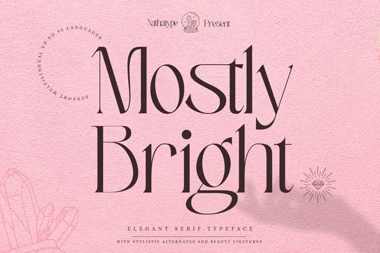
Mostly Bright is a serif font that combines classic elegance with modern features. Its design combines a contrast of thickness, substantial structure, and smooth curves with classic decorative details. Using it in the Neo-Baroque design style will enhance the mood of Baroque dramatization with its modern appearance. Mostly Bright is ideal for art poster headlines, high-end branding logos, classic magazine covers, special wedding invitations, and more.
Ogilen
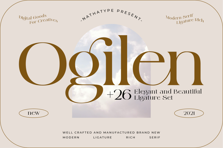
Next, we have Ogilen. It is a serif font that blends a classic elegance with a modern nuance. The design features a balanced proportion with solid contrast in its thickness, making it perfect to evoke a sense of smoothness and clarity. Its smooth serifs and elegant curves strengthen the artistic vibe that resembles classic relics, resulting in a luxurious visual appearance. Ogilen is perfect to add to your Neo-Baroque design style for its luxurious and dramatic nuances. It is perfect for poster headlines, premium branding logos, and exclusive invitations.
Equity
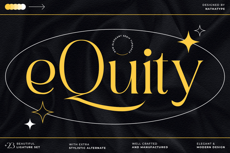
Introducing Equity, a serif font that blends the powerful classic typography with a contemporary touch. With high contrast in thickness, proportional structure, and distinctive curve details, Equity looks like a classic sculpture. You can use Equity to grace the design of Neo-Baroque because of its dramatic and luxurious appearance. Use Equity in your art posters, luxurious logos, and exclusive event invites to enhance your design games.
Castre
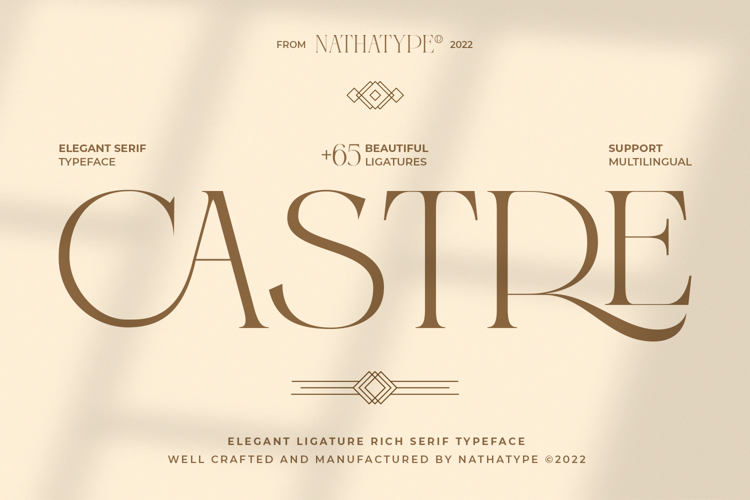
Castre is a serif font that combines a classic nuance and modern touch. This font presents a high contrast, proportional structure, and elegant curves. Castre will be good for poster headlines, premium branding logos, and visual identity that puts emphasis on elegance and dramatic vibe.
Real Magic
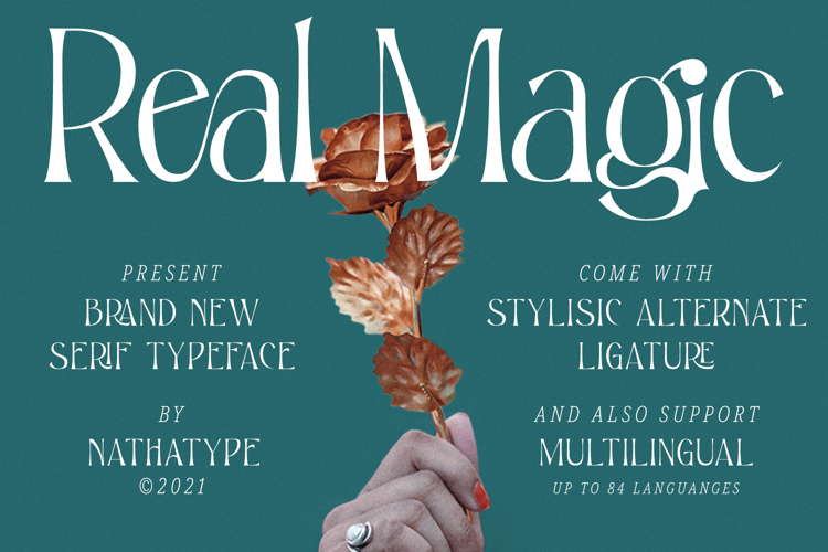
And finally, we have Real Magic. It is a serif font designed to evoke a luxurious yet contemporary feel, thus balancing the tradition of classic typography with modern relevance. This font features elegant curves on several letters that enhance the theatrical impression, while the relatively tall letter proportions convey a sense of grandeur. Real Magic combines decorative elements with the theatrical character typical of Baroque and presents them in a clean structure that is relevantly modern. These advantages make Real Magic ideal for use in headlines, logos, or premium social media that emphasize a grand and elegant image.
Get These Fonts for Your Neo-Baroque Design Now!
Overall, the fonts discussed above show that typography is not just a visual element, but a means to bring back the grandeur of Baroque culture in a modern context. Each font has a unique power to express drama, elegance, and luxury, capable of transforming a simple design into a work full of character and artistic appeal.
Now, it’s time for you to choose the most suitable font for your project needs. Leverage the potential of these fonts to relive the Baroque nuance in your modern design. Create a design that is not only visually appealing but also makes a lasting impression.
