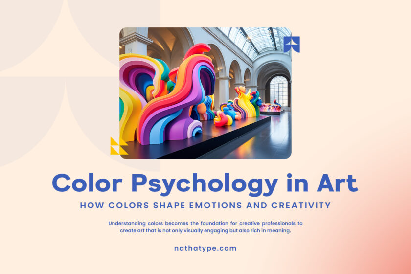
In today’s fast-paced digital landscape, countless visual artworks emerge in an instant, often lacking a defined direction and cohesive structure. However, designs go beyond mere aesthetics; they focus on the powerful delivery of a message through the strategic management of visual elements. Grasping the fundamentals of design is crucial for creating visuals that are not only communicative but also harmonious and well-organized.
Understanding the fundamentals of design will also help designers achieve visual balance, improve readability, and maintain brand consistency across multiple platforms. According to AIGA’s The Importance of Design Principles, design principles serve as the main guidance for developing effective and meaningful visual communication.
Hence, this article will help you understand the fundamentals of design so you can create visuals that are powerful, distinctive, and easily recognizable. By mastering these core principles, your work becomes more intentional and meaningful, supporting a more structured and efficient creative process that enhances your overall workflow.
Table of Contents
Fundamentals of design are the basic concepts in the visual design world that serve as a guide to creating a balanced, communicative, and appealing design. Understanding them allows a designer to guarantee that each line, color, and shape looks good and conveys the intended message. According to the article “Design Principles” from the Interaction Design Foundation, the principles of design are essential for developing effective visual communication.

You need to understand that elements and design principles have different roles, yet they complement each other. Design elements include lines, colors, shapes, and textures, while design principles manage their implementation through balance, contrast, hierarchy, and visual harmony. The combination of design elements and principles helps create a more directed, appealing, and professional visual structure, making an artwork look aesthetic and communicative at the same time. This understanding is in line with the Canva Design School—What Are the Fundamentals of Design and Alex W. White’s The Elements of Graphic Design.
Understanding design elements is key to creating communicative and aesthetic visual artwork, because each effective design originates from a strong foundation. Each design element—line, shape, color, texture, pattern, white space, and typography—has an important role in creating a visual appeal tailored to the designers’ wishes.
The following are some core elements you need to know to create a powerful and harmonious design:
A line is the most basic element that connects two points. It can be straight, horizontal, vertical, curvy, thick, or thin. A line creates a direction and boundary and becomes the basic sketch of a design.
Shape is the area that emerges from the meeting of lines, colors, or textures, while volume adds dimension so that the shape appears to have depth. These two elements help distinguish objects, clarify visual identity, and build spatial structure in both two-dimensional and three-dimensional designs.
Color creates an atmosphere, directs emotion, and highlights essential elements in a composition. Each color has meaning and visual appeal that strengthens the design’s message, attracts attention, and unites elements, making the overall design look harmonious.
Texture represents the character of an object’s surface, whether visually or physically, making us know if it is soft, rough, smooth, or hard. Meanwhile, a pattern is a visual repetition, such as the shapes, lines, or motifs that are managed according to the rhythm and consistency. Both elements are vital to making a design look lively, have depth, and overall be more appealing to the eye.
Space is an area around and among visual elements, including negative space. Space in designs presents balance, clarity, and visual comfort, helping the audience to focus on the main elements without feeling too crowded with the composition.
Typography is the art of arranging letters to clearly and aesthetically convey the message. The choice of font, size, spacing, and style affects how the audience understands the content while also reflecting the visual character that is intended to be built.
The implementation of design elements encompasses various media, such as posters, UI/UX, and packaging, creating a communicative and appealing appearance. For example, in a poster, line helps guide the eye direction while color highlights its main message. In UI/UX, space and typography ensure comfort and readability. Meanwhile, in product packaging, shapes, colors, and textures build a visual identity that appeals to the consumer.
If we are talking about fundamentals of design, then we are basically talking about the core principles of it. Each effective visual artwork is rooted from design core principles that helps create balance, clarity, and visual harmony. The following are some core principles that you need to pay attention to:
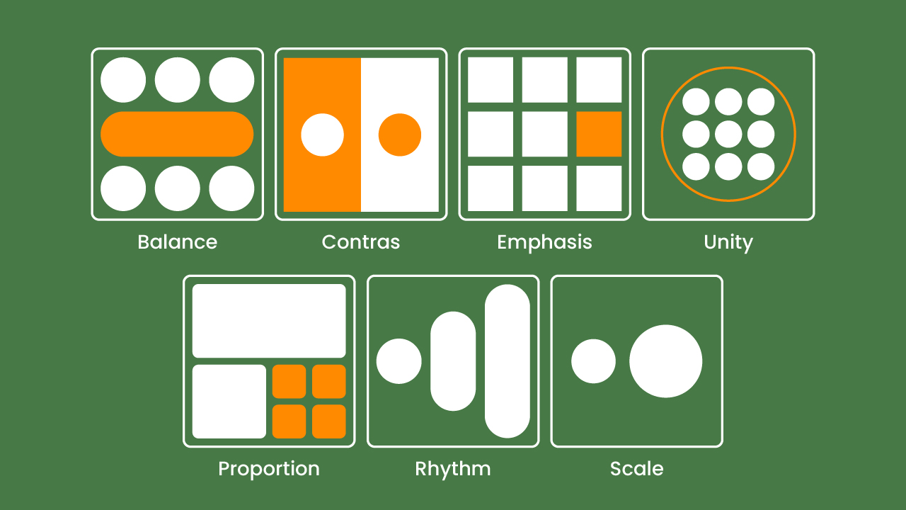
The principle of balance ensures that the visual distribution in a design is stable and proportional. We must preserve the stability of a design by putting each element according to its function. This idea can be implemented using symmetric, asymmetric, or radial shapes that are well-managed to present a comfortable appearance.
Contrast is used to highlight important elements by creating a clear difference, such as color, size, shape, or texture. This principle helps the audience focus on the most vital parts of the design.
Emphasis is a technique to highlight certain elements to make them the center of attention, while hierarchy organizes the order of visual priority so that information can be understood gradually. These two principles work together to help designers manage the audience’s focus. This principle serves to direct the audience’s view so that the main message is conveyed clearly.
Unity is a one of the fundamentals of design that ensures all elements work together as one cohesive whole, while harmony is the visual balance created when those elements complement each other. When unity and harmony are applied together, every part of your design feels connected, resulting in a clean, pleasing composition that helps the audience easily grasp your intended message.
Rhythm is the repetition of visual elements that create a regular rhyme in a design, while movement directs the flow of attention from one element to another. Rhythm and movement help create a dynamic visual flow in a design. Through the repetition of shapes, colors, or patterns, there will be a rhythm that guides the audience’s eyes naturally when looking at a composition.
Proportion is the comparative relationship of carving between elements in a design. This principle ensures that each part has the correct scale so that the composition appears balanced, clear, and pleasant to the eye.
Interface design, editorial design, and modern logos serve as examples of the application of these design principles. These principles serve as “laws” in the fundamentals of design, ensuring order, consistency, and visual balance in every work.
Humans perceive design through natural visual patterns that shape how they capture and interpret messages. Gestalt theory explains that our brains instinctively organize and group visual elements, forming a unified image that is easier to understand. Principles such as proximity, similarity, closure, and figure–ground help us identify patterns, see relationships between elements, and build a strong visual structure. Many design experts emphasize that these principles are essential for creating compositions that are clearer, more intuitive, and more purposeful for the audience.
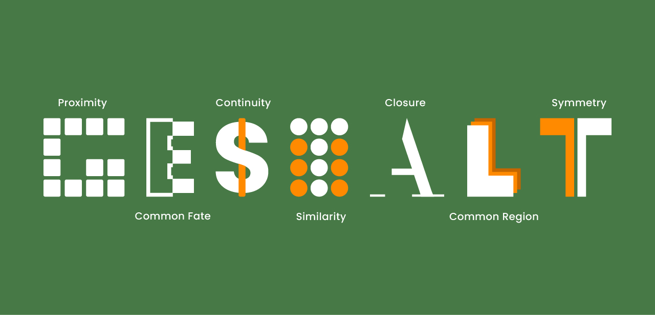
This understanding is in line with Nielsen Norman Group in their article Visual Hierarchy in UX Design, in which regular visual structure helps direct the audience’s attention to the most important information. Meanwhile, MIT OpenCourseWare, through Principles of Visual Perception, emphasizes the importance of visual flow in managing the flow of the eyes. Looking at great visual flow will allow the audience to interpret a design in a more intuitive and effective way.
Visual flow focuses the viewer’s attention from the main piece to supporting elements via positioning, contrast, and guiding lines. This is one of the fundamentals of design that guarantees the prompt delivery of the message by naturally drawing the viewer’s attention from the main element to the supporting elements. For example, in web design, using clear headings, short content, and action buttons facilitates user navigation. Then, a poster with color contrast and repetition of patterns emphasizes the main theme. Understanding composition and visual perception involves not only aesthetics but also how to create effective, functional, and compelling visual communication for the audience.
Even though media keeps on developing, modern design is still rooted in the fundamentals of design. The interactive digital world now widely applies the principles and elements of classic design. We use concepts like balance, visual hierarchy, color, typography, and space to create interfaces that are both easy to understand and attractive. This approach ensures that digital design remains esthetic and functional, allowing users to quickly understand information and interact more comfortably.
In branding, the harmony of colors and shapes plays an important role in building a powerful and recognizable visual identity. According to UX Collective in “Applying Design Principles in Digital Contexts,” visual hierarchy and contrast enhance readability and enrich user experiences, especially in UI/UX designs.
Meanwhile, packaging design uses proportion and white space to highlight the product’s focus and attract consumer attention. As mentioned in the Toptal Design Blog’s article “Design Fundamentals for Digital Products,” modern design becomes more aesthetic, functional, relevant, and adaptable to many contemporary visual platforms when classical concepts are applied adaptively.
Every great design always has a strong foundation. By understanding the fundamentals of design—the elements and principles—designers can build effective visual communication. Principles such as balance, contrast, harmony, and visual hierarchy become a foundation to build a clear and appealing design structure.
With mastery of the fundamentals of design, every creative decision becomes more focused, efficient, and valuable. Whether in print or digital media, the fundamentals ensure that every work is not only visually appealing but also strong in conveying the message.