Typography in general is the right font choice and placement to deliver the desired messages. It is the most important element in a graphic design because the font chosen should be in line with the communication purposes and legible to readers.
Typography plays an important role to determine a design’s aesthetic values. The chosen font should be in accordance with the desired themes and concepts to deliver messages more vividly and to attract readers’ attention.
In addition, typography has a lot to do with spaces among characters, lines, and paragraphs in a text. The appropriate space setting helps to improve legibility and to get the text messages across the readers.
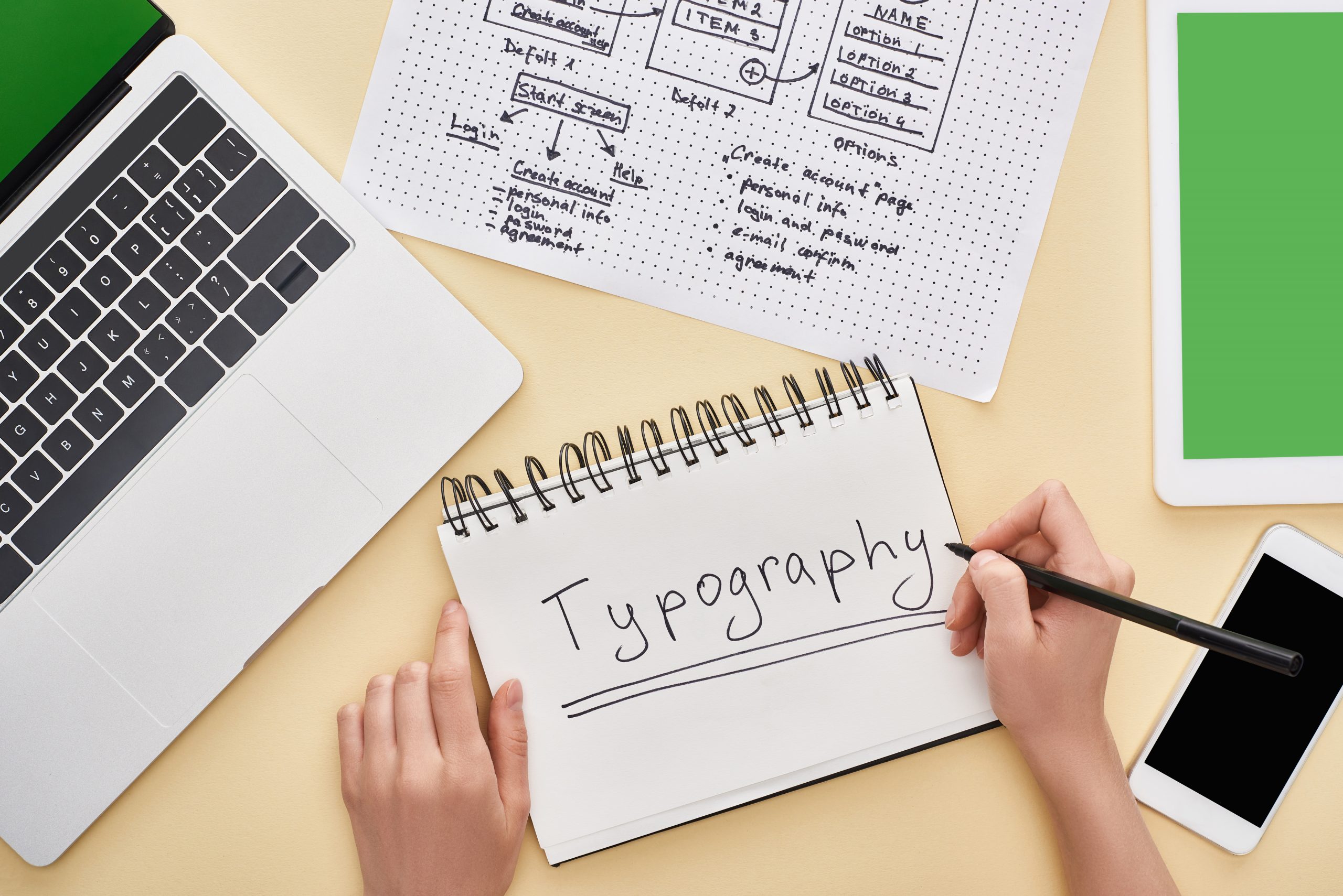
Table of Contents
The typography has given a crucial influence due to the fact that with the inappropriate font, the readers will have trouble understanding the text messages and may find them inconvenient to read causing readers to stop reading.
For that reason, several ways to consider choosing the appropriate font are described as follows.
First of all, be sure to select a font in accordance with the communicative purpose. If you want to deliver serious or formal messages, you will have to select the Times New Roman font or the Arial font, which is more suitable. Otherwise, you can select the Comic Sans font or the Handwriting font for an informal, casual message delivery.
Font size also matters as readers will have trouble reading a text in either too small or big text size. Choose the appropriate font size for the right communicative purpose and readers’ conditions.
Font type is an important element to consider since every font has its own character. Some font types are more legible than the others. As a result, it is recommended to select a legible font for readers.
Make sure to use an appropriate contrast font in line with the background for a colored design. Bad color contrast will make the messages difficult to comprehend by readers.
Avoid using too many different font types in one design. Use only one or two font types instead which are in line with the communicative purpose and the desired aesthetic. Be consistent to use the appropriate font in the project design.
The other unmentioned aspects such as spaces between lines (leading) or spaces between letters (kerning) need more practice to create ideal measurements. With the above considerations, you can choose the right fonts for your project designs and deliver messages more clearly and understandably.
In brief, typography choice is crucial to deliver messages more vividly and to comfort readers to read the text. Make sure to select the right font type, which is legible to readers, in line with the communicative purpose in order that the messages can be well delivered.
