In the world of kids’ clothing design, visually appealing and consistent imagery is one of the key factors in building a strong brand identity. Font selection plays an important role because the right letterform can support the message the brand wants to highlight.
Kids’ clothing font pairings may be the best answer for creating harmonious and understandable design looks. When a font used is acceptable and enables designers to enter the world of children, their designs will be livelier, simpler to recognize, and have a stronger emotional appeal in customers’ eyes.
Additionally, the right font combination will help a brand deliver a message more clearly and shape consistent visual characters. Through this article, you will find various inspirations for effective font combinations to strengthen a kid’s clothing brand’s visual identity, whether in the labels, logos, or other graphic elements.
The following are some kids’ clothing font pairings you can use to strengthen children’s brand visuals. Each font pairing chosen presents a sleek, joyful, and easily recognizable look suitable for various design needs.
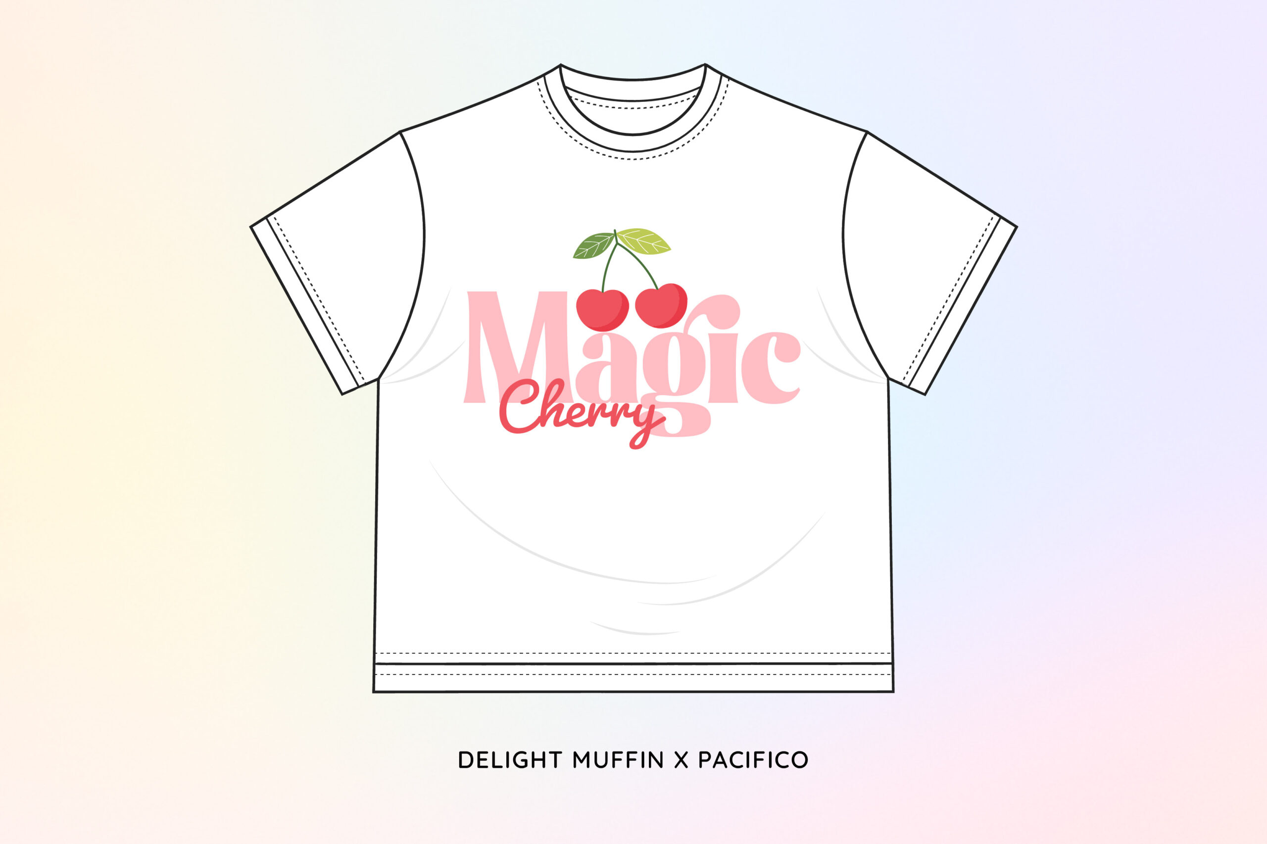
Kids’ clothing requires the combination of typography that can highlight the joyful character without sacrificing readability. The “Magic Cherry” design in this shirt offers a smooth vibe with sweet cherry illustrations. Font Delight Muffin features bold, soft, and rounded letterforms that create a friendly impression and are well-suited for large sizes. These characteristics make Delight Muffin the perfect choice for headlines or main text elements.
Pacifico then added a dynamic touch by using a script style with smooth curves and a steady rhythm of writing. This font has a personal and light feel since its letterforms appear relaxed while being clean. These characteristics make Pacifico an effective supporting element that improves the overall visual appearance.
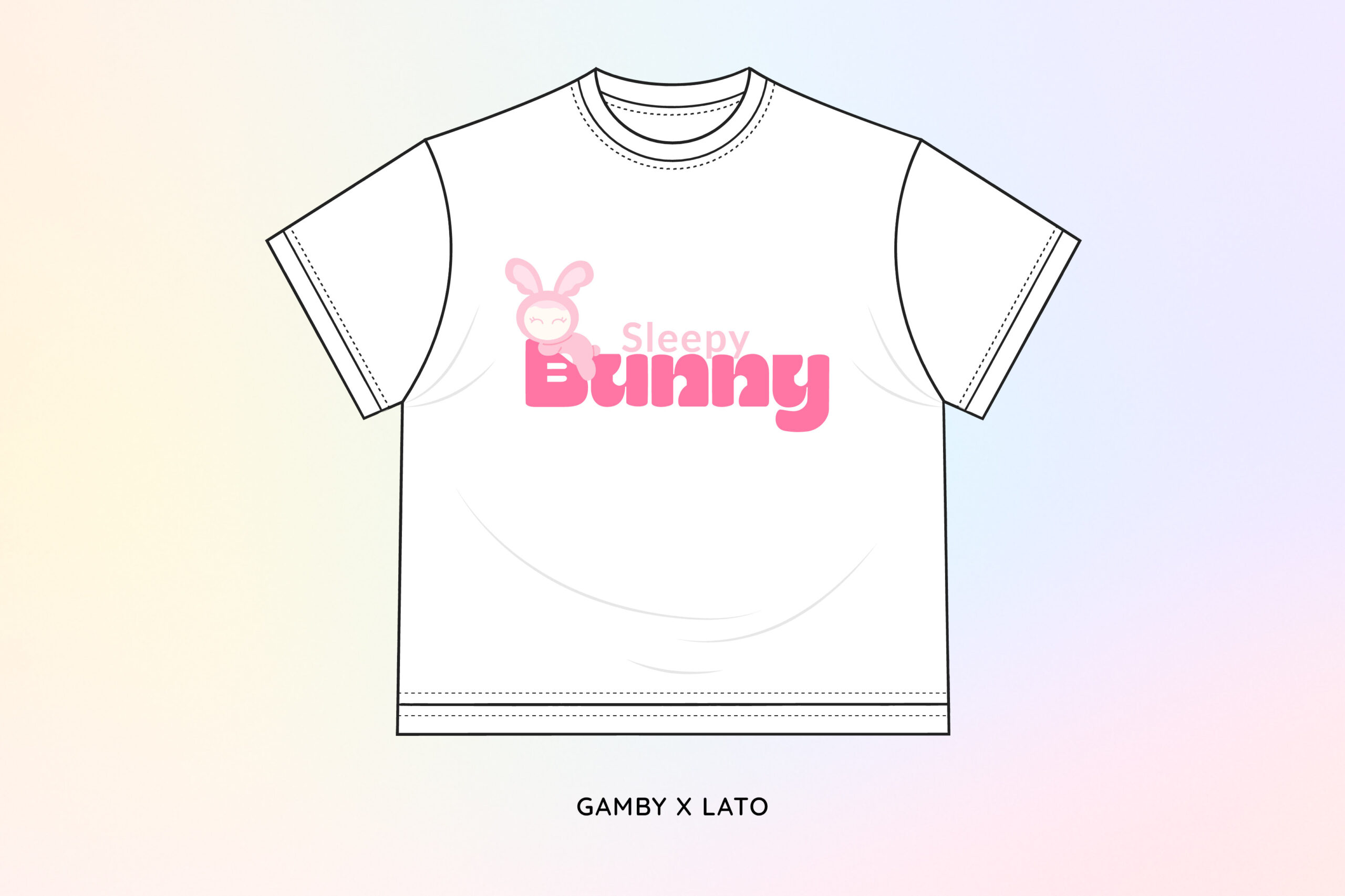
The warm and adorable impression of the “Sleepy Bunny” design comes not only from the illustration. One of the special kids’ clothing font pairing, Gamby x Lato, strengthens the vibe. Gamby is used as the main text. It features bold, rounded, yet smooth letterforms, evoking a playful and friendly sense. The rounded characters of Gamby are harmonious with the rabbit-themed design used in the picture.
As the supporting font, we use the Lato font in the text “Sleepy” for its simple, sleek, and readable look. Lato offers neat letter proportions with smooth curves, giving a balanced contrast with the expressive Gamby. This font pairing is able to strengthen the visual message of kids’ clothing brands in general.
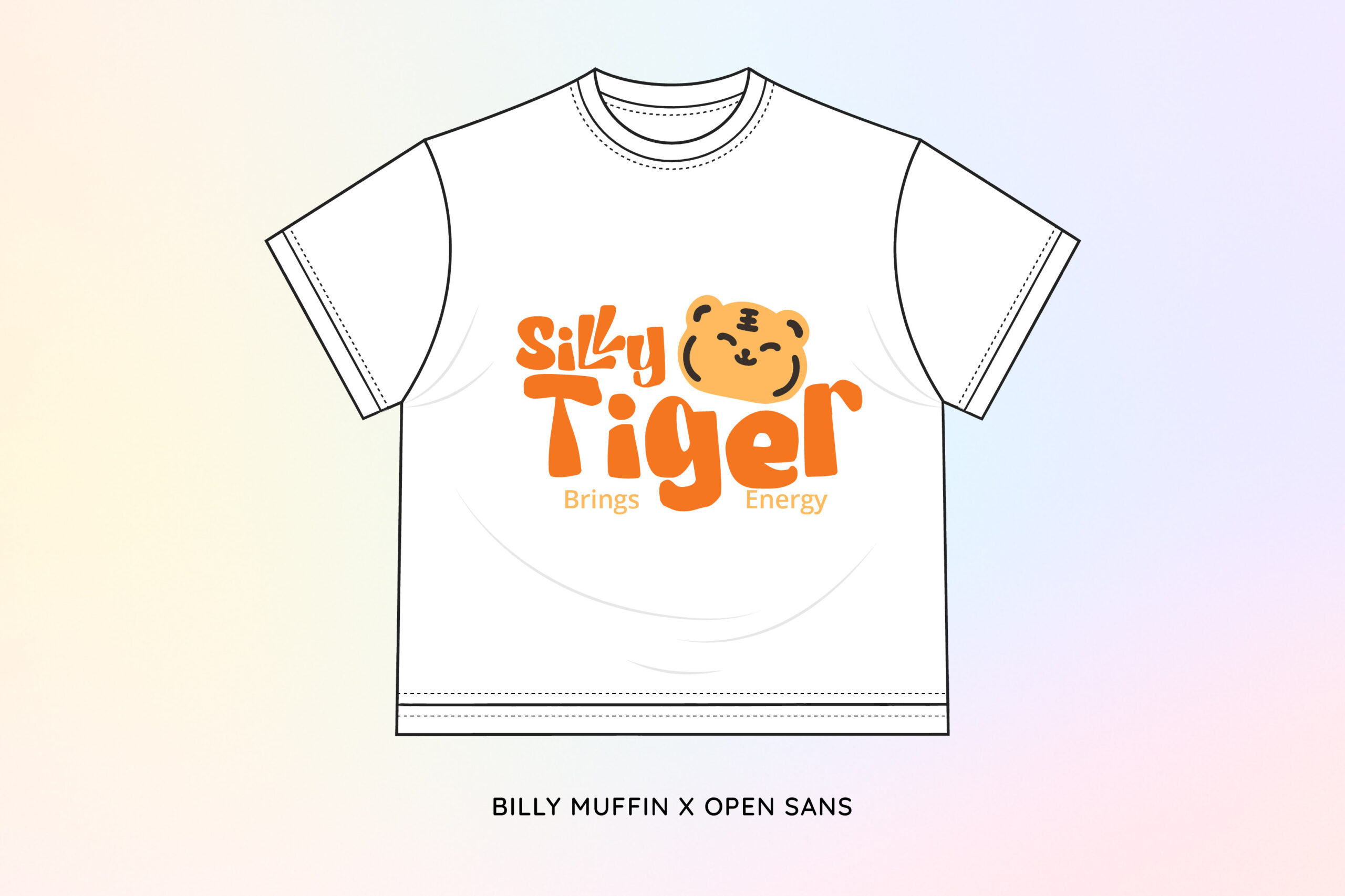
To create a communicative and consistent design appropriate for children’s branding, the perfect combination is required. This is why using kids’ clothing font pairings is important, such as Billy Muffin x Open Sans. Billy Muffin is used in the main text, “Silly Tiger,” with bold, round, and abstract characters that enhance the funny character of the tiger illustration besides the text.
Open Sans was then applied to the text “Brings Energy” to provide visual balance against the more expressive Billy Muffin. Its clean, neat, and easy-to-read appearance makes it effective as supporting text in children’s clothing designs. The presence of Open Sans provides a professional yet friendly touch, making the overall appearance harmonious and organized.
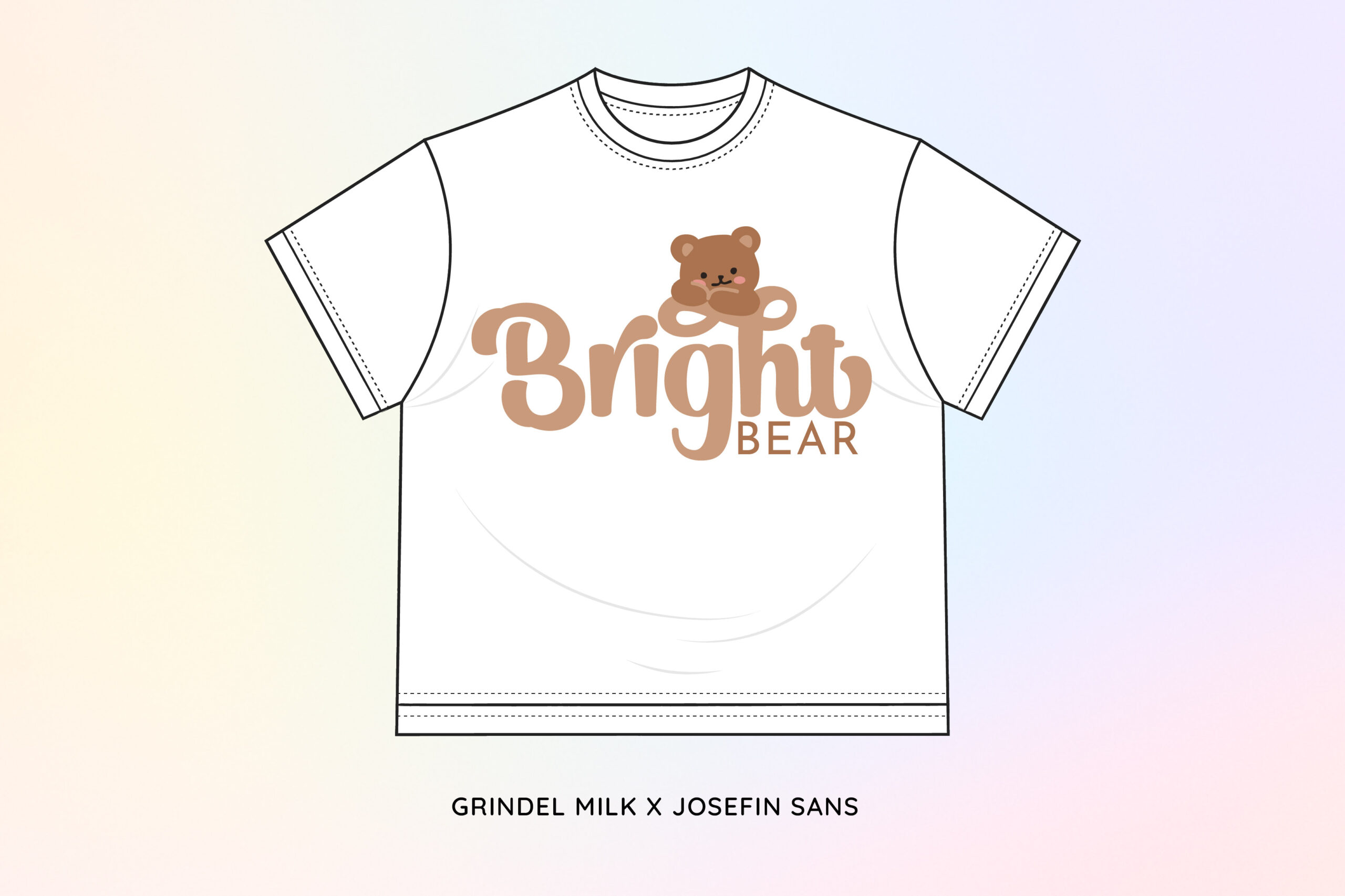
The next on this list of top kids’ clothing font pairings is Grindel Milk x Josefin Sans. This font pairing presents a friendly appearance, especially for kids’ branding. Grindel Milk is used as the main text “Bright,” with its bold, round, and smooth curves. These shapes create a joyful and comfortable feeling, making it perfect to explain the small bear illustration created for the design.
Meanwhile, Josefin Sans was applied to the accompanying text “BEAR” to provide a balanced visual structure. Josefin Sans has a modern, clean, and proportional typeface, creating a neat contrast against the more expressive Grindel Milk. This is one of the kids’ clothing font pairing that creates an overall look that is soft and playful on children’s clothing designs.
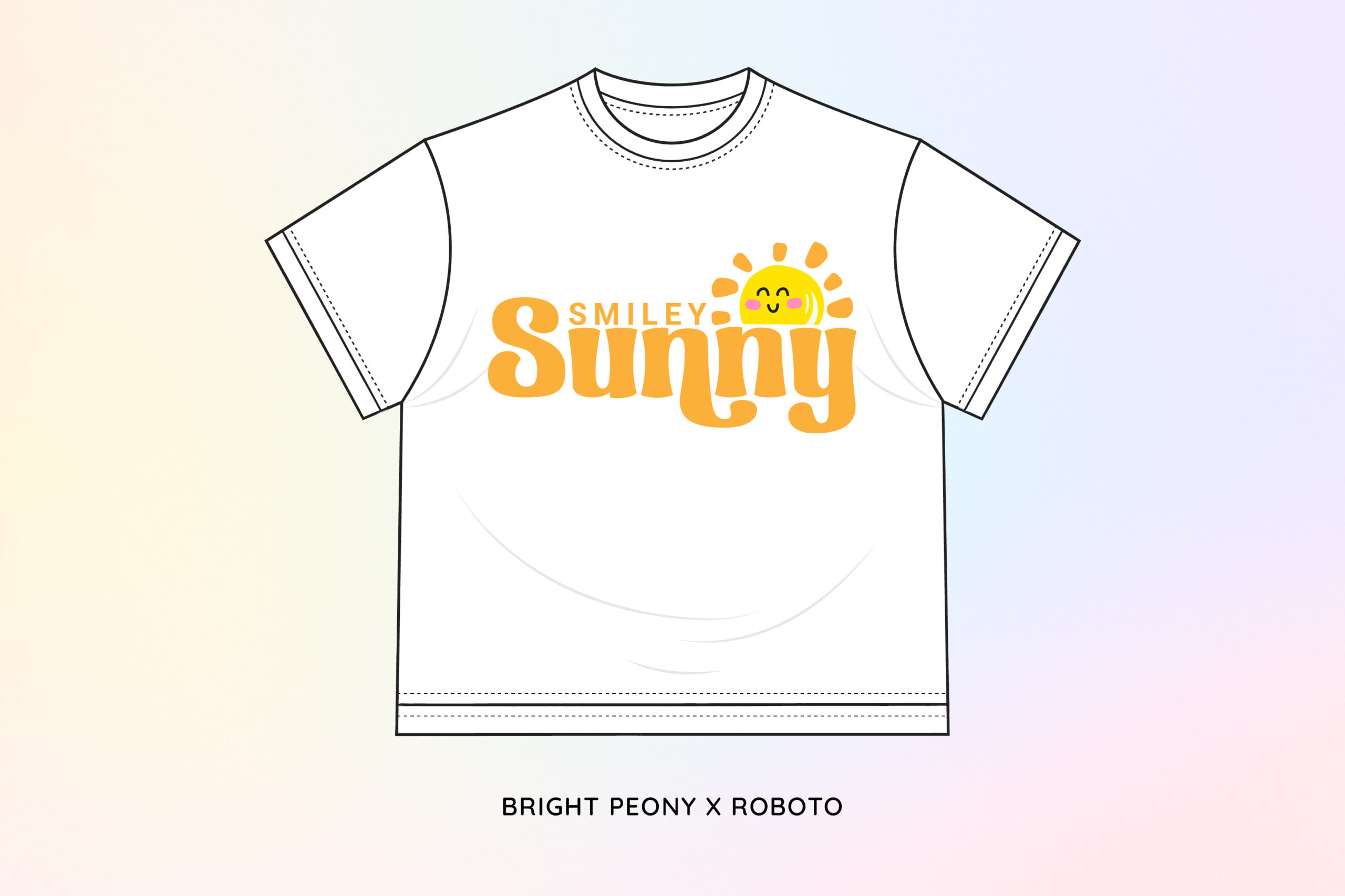
Combining illustration and text creates a visually appealing first impression in children’s clothing design. Bright Peony showcases a playful and expressive character through rounded letters, soft curves, and strong proportions. The dynamics of the curve and the shape of the letters create a warm and cheerful atmosphere, making it look harmonious with the sun illustration on the “Sunny” t-shirt design.
Roboto serves as a supporting font with a modern, clean structure and high readability. Its use in the “SMILEY” text creates a regular contrast and clarifies the information hierarchy. Overall, these kids’ clothing font pairings create a cheerful, modern, and professional look.
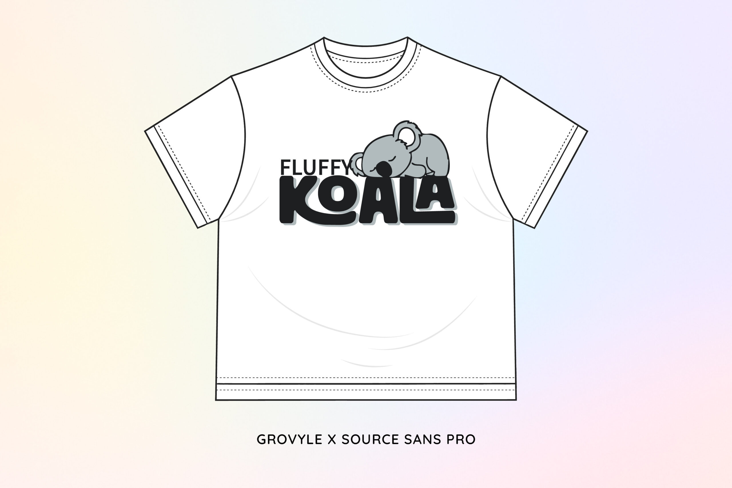
Grovyle has bold, round, and dimensional characters, presenting a soft, playful, and friendly impression for children. The distinctive and solid letterform results in imaginative visuals harmonious with the koala character. The use of Grovyle on the word “KOALA” highlights the main identity and strengthens its connection to the illustration of a sleeping koala, creating a harmonious and recognizable look.
Meanwhile, Source Sans Pro acts as the perfect supporting font with its modern, clean, and great readability. Its application to the text “FLUFFY” results in a consistent contrast and clarifies the information hierarchy. Overall, the Grovyle and Source Sans Pro create a welcoming, modern, and communicative visual harmony, making Grovyle x Source Sans Pro one of the best kids’ clothing font pairings appropriate for the design and branding of children’s apparel.
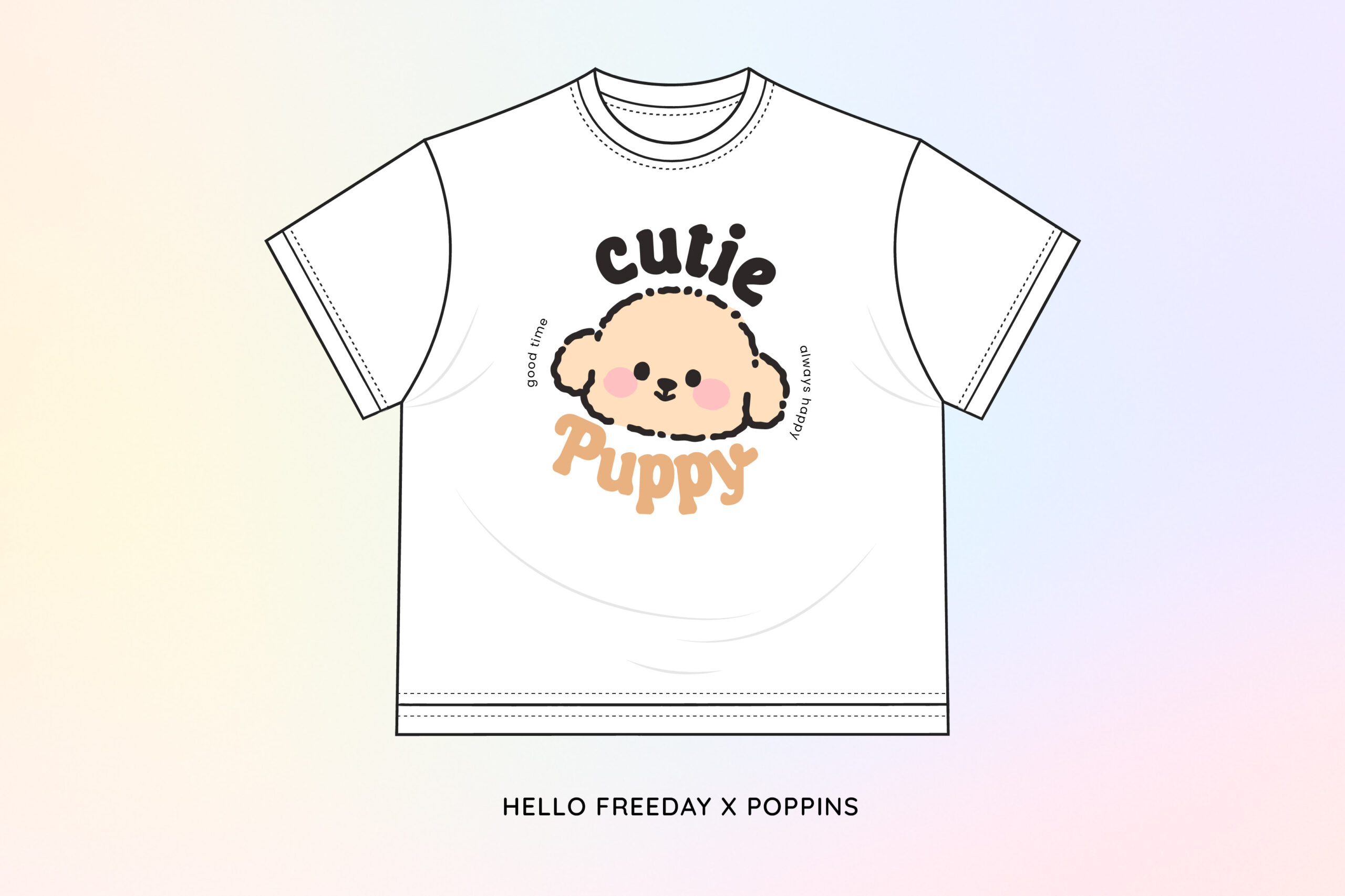
This is one of kids’ clothing font pairings that gives off a strong and communicative visual. Hello Freeday, with its thick, rounded, and gently rhythmic characters, gives a friendly impression for children. Its rounded shape is harmonious with the puppy illustration on the “Cutie Puppy” t-shirt design. The use of “Hello Freeday” with the word “Puppy” strengthens the sweet expression and creates a harmonious look.
Meanwhile, Poppins serves as a companion font with a modern, clean, and clear character. Its neutral sans-serif structure allows Poppins to support the main font without diverting attention. Its application to small text helps balance the composition and clarify information.
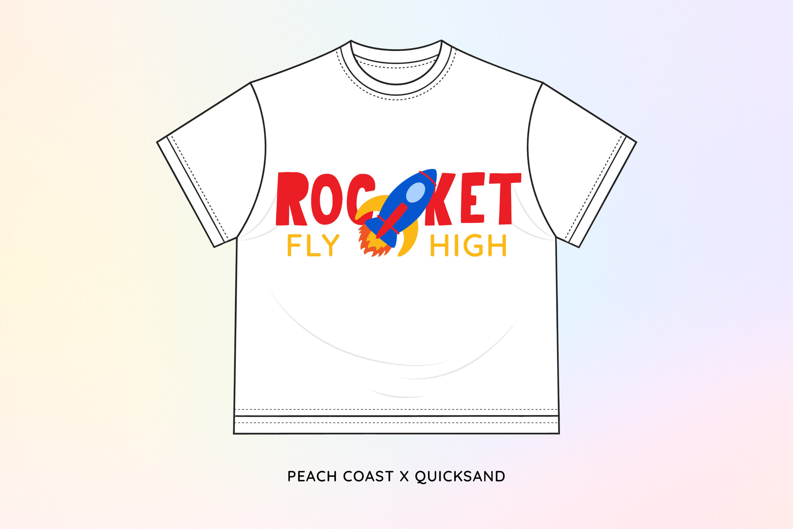
When exploring children’s designs, the font choice not only acts as the typography element but also determines the visual character necessary to build a joyful atmosphere. Peach Coast x Quicksand is a kids’ clothing font pairing that can evoke positive energy in the t-shirt design “Rocket-Fly High.” Peach Coast provides a bold character and free and expressive curves, giving off a sense of strength and playfulness.
Meanwhile, Quicksand serves as a supporting font with a rounded, lightweight, modern sans-serif shape and high readability. The use of quicksand in the text “FLY HIGH” balances the visual composition while maintaining a bright and friendly impression for children. This font pairing creates a communicative look and supports the character of a children’s fashion brand that wants to appear energetic and easily recognizable.
In general, kids’ clothing font pairings present a strong yet friendly and communicative visual. Hello Freeday features bold, rounded letterforms with a soft rhythm, creating a warm and playful feel that resonates well with children. Its rounded shapes align perfectly with the puppy illustration on the “Cutie Puppy” T-shirt design. Using Hello Freeday for the word “Puppy” enhances the sweet expression and creates a harmonious overall look.
Meanwhile, Poppins serves as the supporting font with a modern, clean, and highly legible character. Its neutral sans-serif structure allows Poppins to complement the primary font without drawing attention away from it. When applied to smaller text, Poppins helps balance the composition and conveys supporting information.
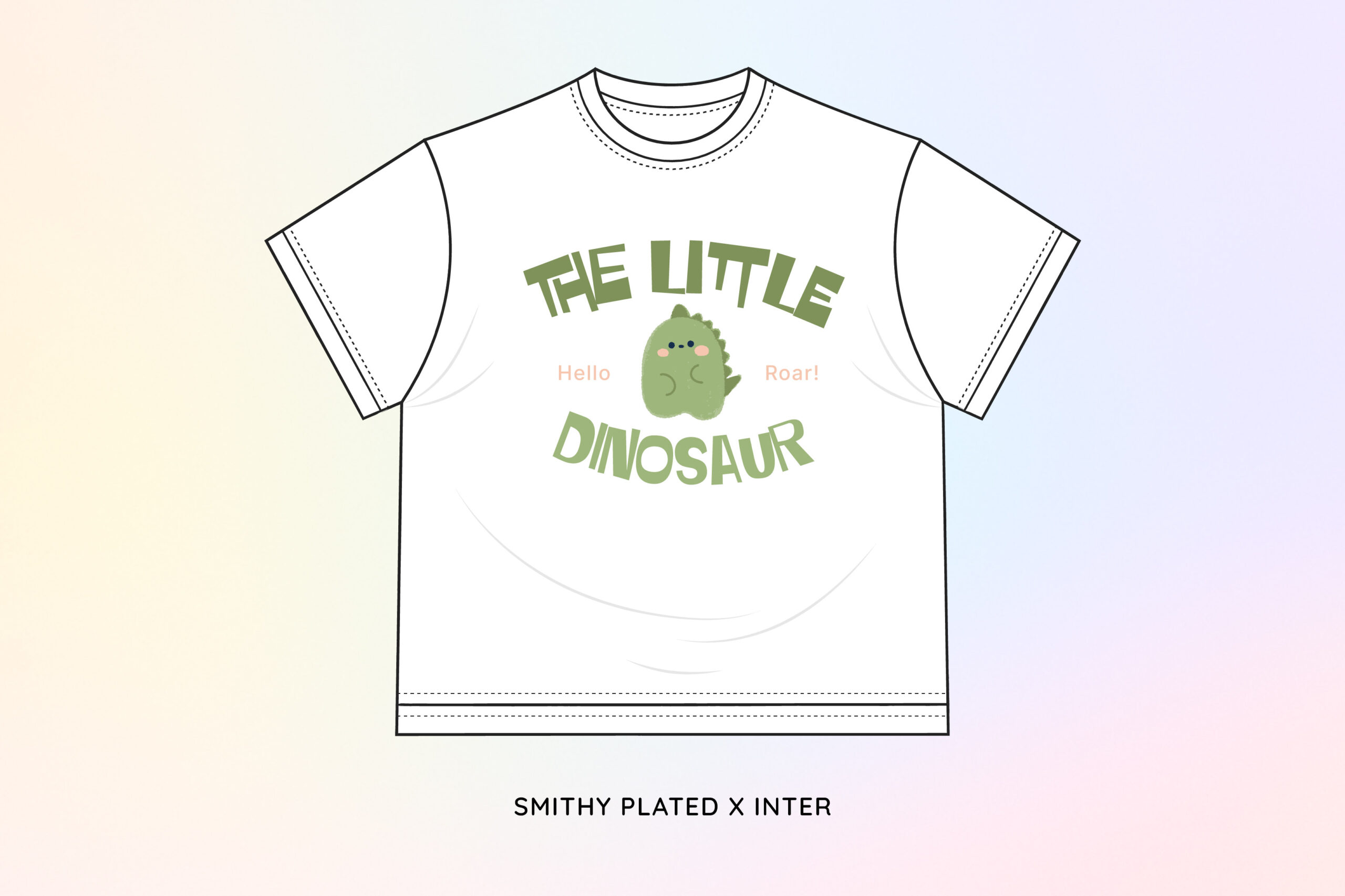
Smithy Plated is used as the main font for the text “THE LITTLE DINOSAUR.” This font has a bold, rigid letterform with abstract stroke thickness, making the visual character incredibly unique. The bold yet friendly letter structure aligns with the illustration of a small dinosaur in the center, creating a playful impression. The slightly distorted letterforms also add visual dynamics that support the adventure theme in the children’s clothing design.
And then, Inter is used as the supporting font, as seen in small texts like “Hello” and “Roar!” This font has great readability with its sleek and clean shape. Inter functions as an additional element that highlights clarity without stealing the attention from the main text. This is one of the kids’ clothing font pairings that can result in harmonious, joyful, and communicative looks, perfect for designing kids’ clothing.
Overall, the use of kids’ clothing font pairings not only serves as a visual element but also as a character and atmosphere builder that supports the brand’s message. Each font combination brings its uniqueness through the blend of shapes, rhythm, and readability, thus creating a visual identity that is cute, attractive, and easily recognizable by children and parents.
By understanding the character and function of various kids’ clothing font pairings, brands can design children’s clothing that is more communicative and visually consistent. Start exploring the font combinations that best suit your brand’s character and create kids’ clothing designs that capture attention and strengthen customer recall.