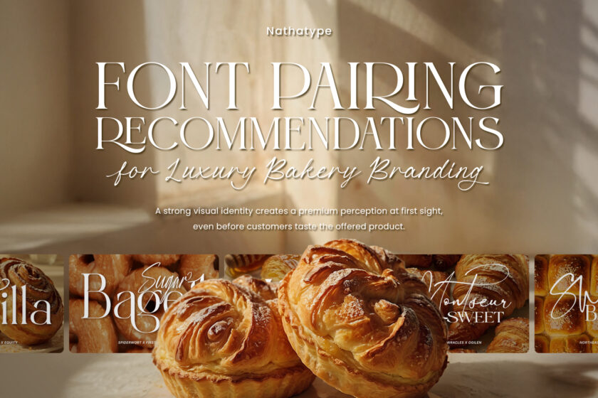
In the world of bakery branding, cafés, restaurants, and other F&B businesses, a luxurious impression is not only determined by the service and serving quality but also by their consistent visual look. A strong visual identity creates a premium perception at first sight, even before customers taste the offered product.
The selection of luxury fonts for bakery branding becomes one of the important elements in building the image. The combination of script font and serif or script with sans serif often provides an elegant and exclusive impression while still feeling warm and readable. Script font works as an artistic accent that strengthens the brand character, while serif or sans serif fonts maintain the visual structure, professionalism, and readability.
Using luxury fonts for bakery branding, the brand can appear more premium without throwing off its friendly and authentic impression. This article will discuss how the implementation of these font combinations can effectively create a luxurious and classy visual identity.
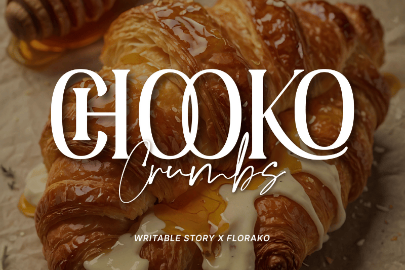
Behind the look of a classy bakery, there is a typography combination that is planned to show a luxurious impression. In this discussion, the concept of luxury fonts for bakery branding presents a strong visual balance through the combination of Writable Story and Florako. Writable Story as a script font provides smooth, flowing, and handwritten-like strokes. Those characteristics are effective to convey a handmade impression and give attention to details that often become the main point in bakery products.
On the other hand, Florako works as a serif font with a firm, neat, and classy letter structure. The proportional serif detail and balanced line contrast create a luxurious, stable, and trustworthy impression. The combination of both creates bakery shop branding that looks elegant without stiffness and luxurious without losing its friendliness and professionalism.
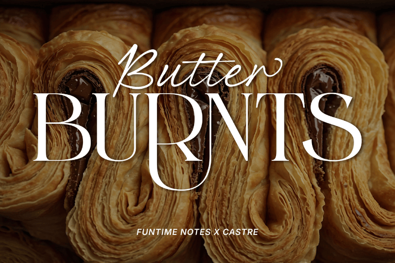
The right luxury font can strengthen the luxury bakery’s character at first sight. The Funtime Notes and Castre combination presents a harmonious visual balance between warmth and professionalism, making it a perfect combination in this list of luxury fonts for bakery branding. Funtime Notes, as a script font, shows a flowing and natural handwritten character, allowing it to represent a high skill that is identical with a quality bakery product.
Meanwhile, Castre acts as a serif font with a firm, proportional, and classy letter character. Those characters create a stable, elegant, and trustworthy impression. When combined, these fonts complement each other, building a premium visual identity that is not stiff, luxurious without losing its warmth, and close to customers.
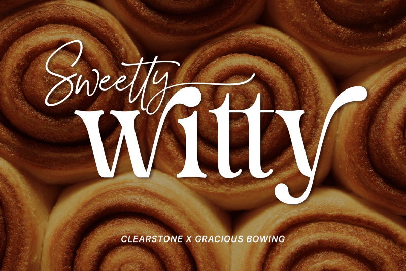
The combination of these fonts complements each other in building a premium visual identity without stiffness. Clearstone and Gracious Bowing present an elegant balance between strong structure and soft expression. Gracious Bowing as a serif font presents soft, clean, and proportional letter characters, reflecting high quality and professionalism. These characteristics make Gracious Bowing ideal as a main font for a brand name or headline in premium bakery branding.
As a supporting font, Clearstone provides calm, flowing, and elegant strokes. This font’s uniqueness lies in its dynamic line flow, giving a feminine and friendly impression. This combination of luxury fonts for bakery branding is ideal to convey a premium and classy image.
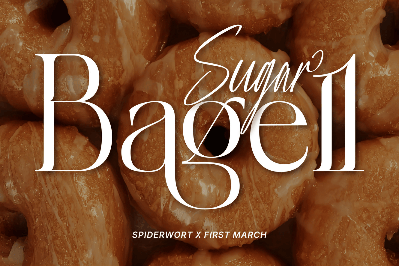
In the field of classy bakery branding, the selection of fonts becomes an important factor in delivering values and product quality. Spiderwort is a script font with dynamic, flowing, and expressive stroke characters. The letterform is like a modern handwritten letter with an elegant touch, allowing it to present personal and artistic impressions. Spiderwort’s uniqueness lies in its dynamic letterform and precise handwriting.
Meanwhile, First March is a serif font with a strong, proportional, and classy letter structure. The controlled line thickness contrast and its neat serif detail create an elegant, stable, and professional impression. The combination of these luxury fonts for bakery branding makes a bakery’s visual identity look classy and consistent, reflecting the quality of the products offered convincingly.
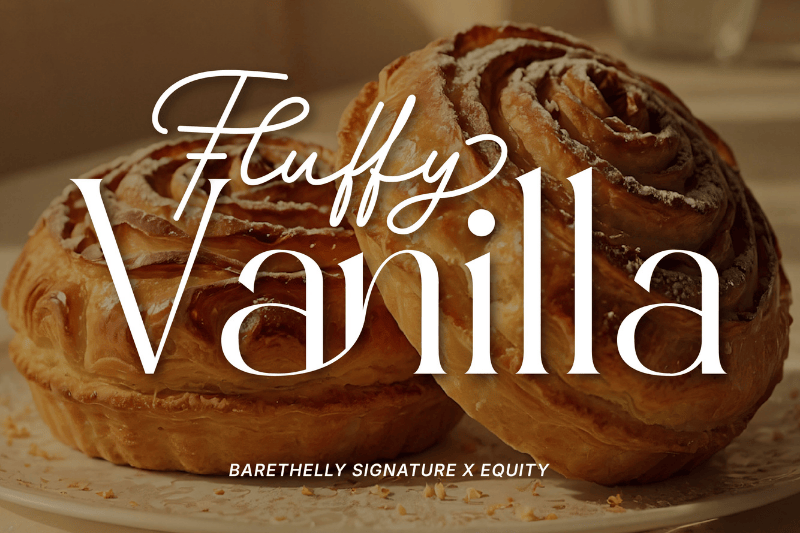
In the context of the classy bakery’s visual identity, the combination of Barethelly Signature and Equity presents a personal touch for customers. Equity works as a serif font with a sturdy, neat, and proportional letter structure. The firm details of the serif and its balanced line contrast create an elegant, stable, and trustworthy impression.
As a companion, Barethelly Signature is a script font featuring soft, flowing, and expressive strokes. Its letterforms resemble an elegant signature, uniquely characterized by its natural and consistent stroke rhythm. The combination of Barethelly Signature’s softness and Equity’s formal structure makes them suitable as one of the best combinations of luxury fonts for bakery branding, presenting a premium, professional, yet warm image to customers.
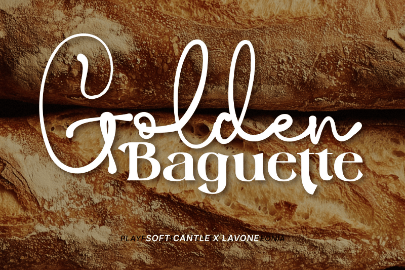
The warm feeling from a quality bakery product needs to be translated into typography that allows the brand to deliver the brand’s value consistently. Lavone is a serif font with bold letters but still looks elegant. This character provides a personal and friendly nuance without reducing exclusiveness.
As a companion, Soft Cantle works as a script font with soft, proportional, and detailed soft-curved letter characters. The unique yet soft letter characters are good to use as a companion element to affirm a premium bakery identity. The combination of both results in a layered typography composition, making the view flow shaped naturally from the main elements to the supporting details. As a result, the shop’s identity looks classy and has a strong visual character, in line with the concept of luxury fonts for bakery branding.
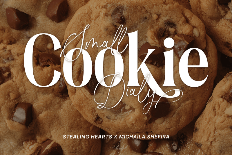
The delight of a premium bakery doesn’t come only from the taste but also from its captivating visual at first sight. Michaila Shefira presents soft, flowing, and decorative strokes. The letter character provides a personal feeling that is in line with the image of premium bakery products.
As a balancing visual character, Stealing Hearts is a script font with firm, proportional, and clear contrast line letter characters. The uniqueness of this font lies in its ability to emphasize headlines without appearing heavy, ensuring that the text remains easy to read and looks exclusive. The combination of these luxury fonts for bakery branding creates a balanced visual look that strengthens the overall brand identity.
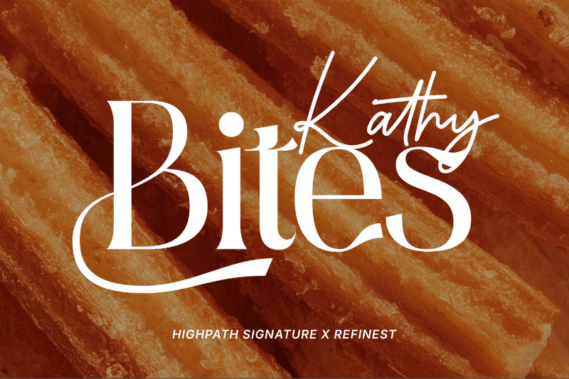
The exclusive and classy feel of bakery branding emerges through a combination of carefully designed typography, as in the example. Highpath Signatures employs a contemporary signature style with a consistent monoline structure, presenting a sense of exclusivity without being overdone. Each letter’s curve creates a dynamic visual rhythm without compromising readability. This character makes Highpath Signature good as accent elements in logos, headlines, or featured product tags.
Refinest provides a firm, proportional, and precise letter character. This serif font presents a balanced thin-thick contrast with a sharp and neat serif detail, resulting in a luxurious and formal impression. Refinest gives a visual that is bold and standing out, strengthening the professional image in the context of luxury fonts for bakery branding.
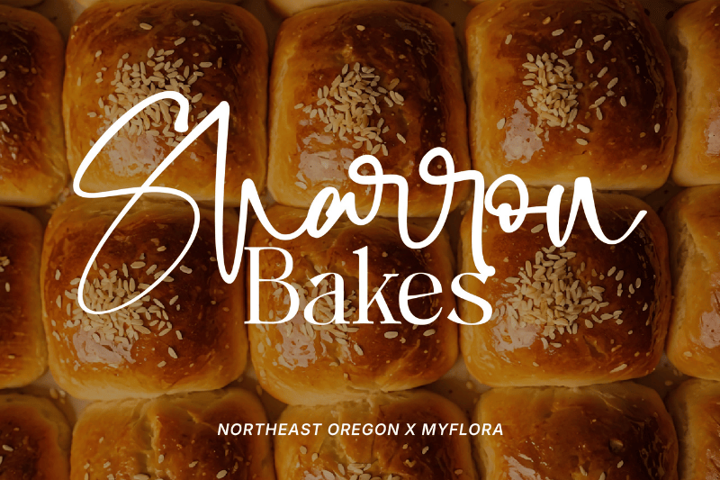
In this combination, Northeast Oregon works to create an initial attraction through a soft, flowing, and expressive script character. The uniqueness of this font lies in the balance between decorative elements and visual clarity, making Northeast Oregon effective as the main element for logos or a bakery brand’s name.
Once Northeast Oregon draws attention, Myflora plays an important role in maintaining the visual order. Its clean, proportional, and easy-to-read letter structure helps deliver information without compromising its sense of exclusivity. Myflora’s presence creates a visual balance for Northeast Oregon, making both fonts an attractive addition to the collections of luxury fonts for bakery branding.
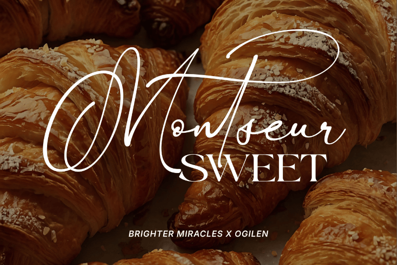
Before one even experiences the taste, the aroma of freshly baked pastry often forms the first impression.This nuance is perfectly reflected in this combination of luxury fonts for bakery branding, Brighter Miracles x Ogilen. Brighter Miracles features letters with long, flowing, and natural strokes, creating a soft yet distinctive visual impression. The smooth curves and consistent connection between letters make this font appear supple, elegant, and not overdone.
As a balance, Ogilen provides letterforms with neat, proportional, and controlled structure. Each letterform has a spatial balance, thus maintaining readability at various sizes. Ogilen’s uniqueness lies in its flexibility in supporting typography hierarchy, whether as supporting text, product information, or descriptive elements, without distracting from the main element.
Through the list of combinations of luxury fonts for bakery branding discussed above, we can conclude that typography has a strategic role in building a premium bakery image. The combination of a script font with a serif or sans serif strengthens a luxurious impression and maintains the balance among visual expression, readability, and brand consistency. The right choice of font combination can convey product quality, brand character, and a sophisticated visual experience at first glance.
As the next step, bakery business and visual designers need to evaluate the use of typography in logos, packaging, and promotional materials more purposefully. Select and apply the luxury fonts for bakery branding that align with the brand’s character to ensure a consistent, convincing visual identity that leaves a lasting impression on customers.
