In the history and journey of art, color has not only served as an accessory but also plays a crucial role in how we interpret art. From classic paintings to contemporary pieces, artists utilize color to convey emotions, stories, and influence how audiences perceive their work. This concept is known as color psychology, which explores the strong connection between color and human emotions.
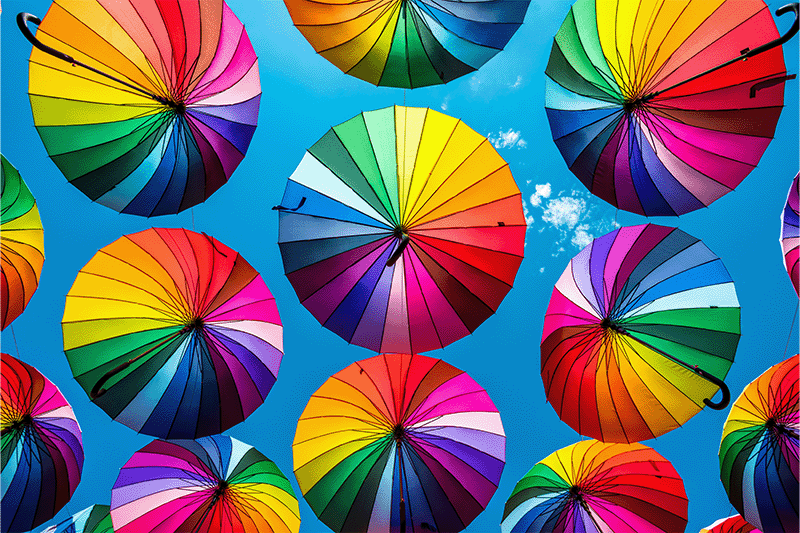
Psychological and neurological research demonstrates that each color has its own distinct emotional response. Warm colors—such as red and yellow—are often associated with enthusiasm, energy, and optimism. In contrast, cool colors, like blue and green, give a calm and balanced impression. Understanding colors becomes the foundation for creative professionals to create art that is not only visually engaging but also rich in meaning.
This article discusses the psychological strength of color in art and design, exploring how color shapes emotion and influences creativity. Understanding color psychology will help you present a visually memorable artwork.
Table of Contents
Color psychology in art is one of the studies on how color influences emotion, mood, perception, and human behavior. It’s important to note that this field differs from color theory, which focuses on the technical aspects of color, such as harmony, contrast, and color composition.
In design and art, color acts like a sign; it’s able to convey messages without the need for words. Designers and artists use color to influence the audience’s feelings, create atmosphere, and even imply a hidden meaning. To give you an idea, the use of a dark color palette can present a dramatic and mysterious nuance, while a pastel color palette often gives a soft and calm impression.
With a deeper understanding of color psychology, an artist doesn’t only choose color for its aesthetic purpose but also considers how their art can build an emotional connection with the audience.
The relation between color and emotion is not a myth; it’s a phenomenon that has been studied by psychologists, neurologists, and the science of visual communication. Color works as a visual stimulant that affects the brain and nervous system, so it triggers certain emotional reactions.
Every color has its own frequency and intensity, which produces a unique emotional experience. Biologically, the retina catches color and processes it to the brain through the light waves of a certain magnitude and length. For example, red has a bigger light wave than other colors, which is then associated with energy, desire, or danger. In contrast, blue with a shorter light wave will provide a feeling of peace and stability.
As discussed above, social and cultural factors also affect the perception of color psychology. Someone who has a pleasant memory about a certain color will probably feel a sense of warmth every time they see it. Moreover, in a cultural context, the same color can have a different meaning in different regions and customs. To give you another example, white is considered a symbol of purity in the West, while in the East it symbolizes mourning.
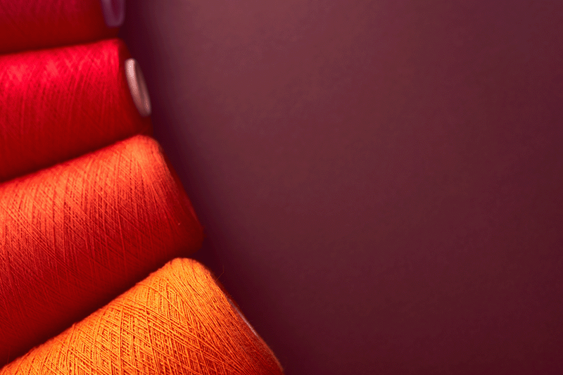
Warm colors are often associated with enthusiasm, passion, and liveliness. In artworks, warm color combinations can build an intense emotional atmosphere. We can see it from expressionist paintings that use dark red and bright orange to express the inner conflict or revolutionary spirit. Here is the detailed explanation of several warm colors:
Red is the strongest and emotional color. It symbolizes love, passion, bravery, and power. In another context, we can also associate red with feelings like danger, aggression, and anger.
In modern art, expressionist artists use red to create emotional intensity and inner conflict. While in branding and design, they use red to gain attention.
As a result of the mixture of red and yellow, orange is often used by artists to present a warm atmosphere that is more friendly than red. This color, according to color psychology, has the meaning of creativity, enthusiasm, and optimistic feeling.
Most contemporary art applies orange to make a younger impression, dynamic, and lively. In pop culture, orange is often associated with freedom and adventure.
Yellow represents the rays of the sun, optimism, and happiness. According to color psychology, yellow stimulates warm feelings and positive energy. However, in high intensity, yellow can create tense, even restless feelings.
Vincent van Gogh mostly uses yellow to express life intensity, such as in his Sunflowers painting. Yellow is often used as the visual focus because it’s the brightest spectrum that can be easily caught by human eyes.
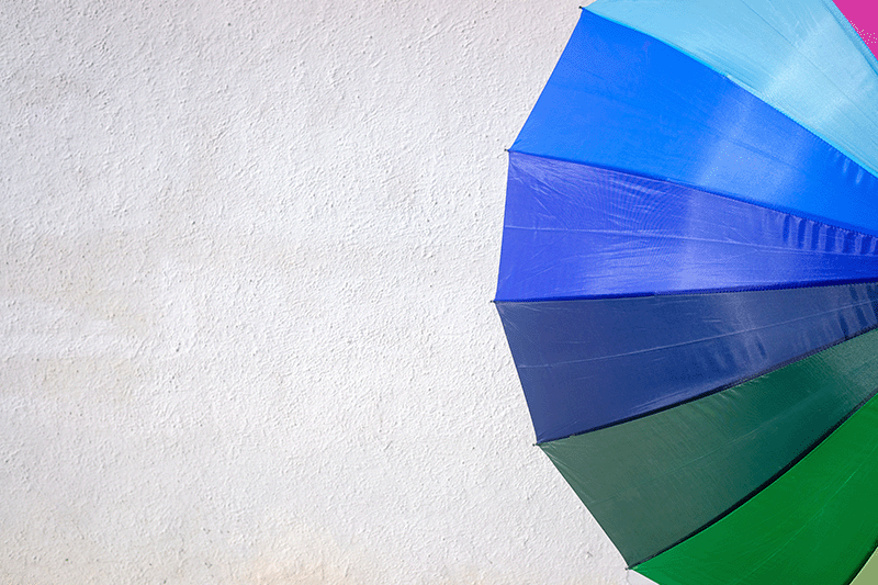
Different from the warm colors that are full of intensity, cool colors like blue, green, and purple often represent peace, balance, and inner reflection in color psychology. These colors are associated with earth elements like water, sky, and forest, so they give a deeper and peaceful impression.
This color is the most associated with peace, belief, and stability. In color psychology, blue lowers the heart rate and has a relaxing effect, so it’s often used for works with contemplative themes.
In modern design, blue is often the dominant color for finance and technology brands. In classic art, artists usually use blue to depict holiness and spirituality.
Green becomes the symbol of nature, growth, and harmony. This color is calming because it connects with a friendly, natural landscape. According to psychology, green reduces eye stress, which gives the eyes relaxation and emotional balance.
In art and branding, green is synonymous with sustainability, health, and eco-friendly products. It also represents fertility, life, or eternity.
Purple combines the stability of blue and the energy of red, creating spirituality, imagination, and luxury. Psychological science often associates purple with creativity, mysticism, and spiritual depth.
In religious art, purple symbolizes nobility and transcendence. Meanwhile, in pop culture and modern design, purple often denotes exclusivity.
Art history shows how color always acts as the main medium in delivering meanings, not only beautifying it. Every art move brings a different approach to symbolism and color psychology in creating ideas, emotions, and even social-cultural values.
Impressionist artists like Claude Monet or Pierre August Renoir apply bright colors with short brush strokes to give the visual impression or sensation that the artists feel when seeing the object. Pastel colors, light blue, and golden yellow in color psychology are used to present an optimistic, full of light, and natural atmosphere.
Andy Warhol and Roy Lichtenstein pioneered the pop art movement in the 1960s, using the primary colors—red, blue, and yellow—with sharp contrast. The colors chosen include a bold and striking color palette, because it gives a straightforward, modern, and close to everyday life impression. Andy Warhol, in his series, Campbell’s Soup Cans, uses bold red and white colors to stress the iconic consumption culture in America.
In surrealist art, color isn’t only a symbol; it’s also the door to the imaginative world, which is often applied by artists to create a dream atmosphere full of tension. Artists like Salvador Dali use extreme contrast colors, such as dark blue with bright orange, to bold the unconscious conflict.
The Bauhaus movement (1920 – 1930) stresses the relation between shapes and colors. Artists like Wassily Kandinsky relate specific colors and shapes, like yellow and triangles for energy, blue and circles for spirituality, and red with rectangles for strength.
Color in art and design keeps on developing following the changes of society, culture, and technology. Every era represents a specific palette that reflects the trend and the society’s appreciation in a specific period. Here are the latest color trends that can help artists and designers stay relevant and visionary in doing their work:
The combination of soft pastel colors with metallic or neon touch creates a futuristic atmosphere that is soft, but modern. This trend is popular in digital illustration, web design, and even in fashion, because it gives an optimistic, friendly, and inclusive impression.
The earthy palette, such as brown, olive green, and cream, is increasingly popular with the surge of environmental awareness. In color psychology, earth tones reflect sustainability, simplicity, and human closeness to nature.
On the other hand, bright neon colors—like magenta, cyan, and neon green—appear as symbols of the digital era and pop culture. This color palette is often used in designs that want to appear brave, provocative, and full of energy, especially in visual music, gaming, and streetwear art.
Color is always the fundamental element in art, because its strength shapes the emotions, meanings, and perceptions. From the long journey of art history, we see how we use color to tell cultural symbolism, create atmosphere, and even express a vision.
Through the color psychology perspective, it’s clear that each color palette has its own language and color psychology that can speak directly to the audience. Understanding those, artists and designers can create artworks that are not only beautiful but also give an emotionally lasting impression.
Visit other articles from Nathatype and find various new insights that are helpful and inspiring!
