Print design leaves very little room for mistakes, especially when creating print collateral. A web page can be fixed in a matter of seconds. But not a printed piece once it comes off the press. You can’t, for example, go back and fix tiny, hard-to-read text on a business brochure that’s already in a client’s hands.
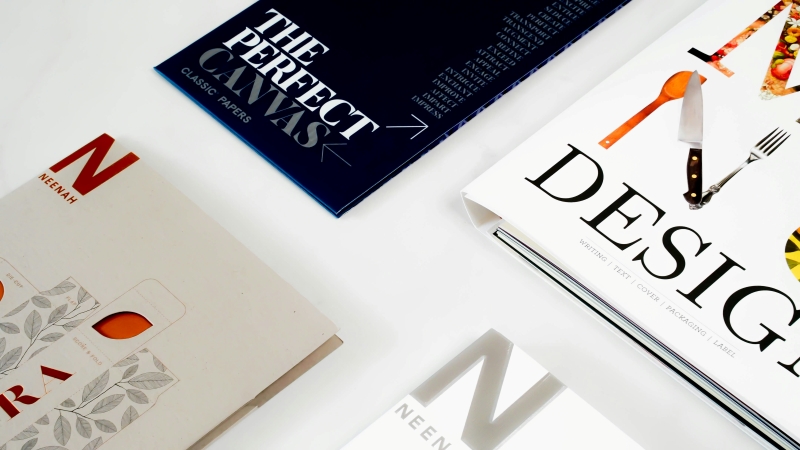
But because print collateral, including brochures, flyers, business cards, catalogs, and presentation folders, is meant to represent your business, it needs to do more than look good. These materials should also get their message across without forcing readers to work for it.
How important is this in today’s highly digital world? Quite important, as it turns out. A 2024 study sponsored by Japan Post using promotional coupons found that print coupons generated higher redemption rates than online coupons. That’s just one example to show that tangible materials still have a place in today’s marketing mix.
Read on to discover how to give your print collateral that kind of advantage.
Table of Contents
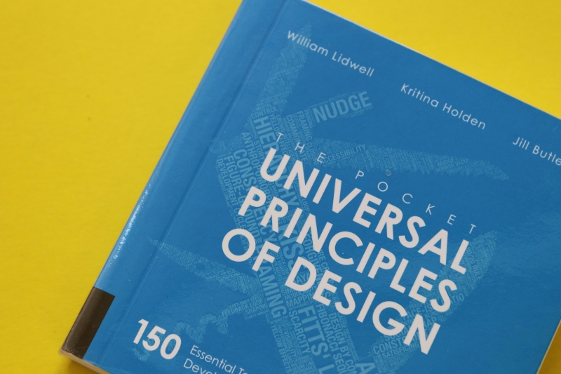
The six principles below aren’t six separate rules that designers apply to different projects. They work as a system and should apply to any print project. Let’s look at them one by one.
Visual hierarchy is what decides how people notice things on a page. Its job is to show at a glance the important content and what can be read later. Designers usually use size, weight, color, and placement to get there.
Imagine you’re creating a product brochure. The product name and its main benefit should catch the eye first. A short description follows, then the specs and contact details. That’s the visual hierarchy at work in everyday design. Make everything equally large and bold, though, and readers are left to figure out the order themselves.
Graphic designer Akshat Pandit recently said on LinkedIn that 90% of designs fail at first glance before the message has a chance to register. His point is that good typography is about more than choosing a nice font. It’s about being able to control what someone sees first, second, and last.

Contrast works by setting elements against each other, so the eye knows where to land. Light against dark. Bold against regular. Big against small. On a business card, for example, a dark logo on a light background does far more than a busy pattern could. There’s a practical side too. Text needs enough contrast with whatever sits behind it, especially for readers with low vision.
Designer Robin Williams puts it plainly in The Non-Designer’s Design Book: “Contrast is often the most important visual attraction on a page.” It’s hard to argue with that. Strong contrast makes reading easier, and a beautiful layout falls flat if people struggle to read the words on it.
That’s where accessibility comes in. Print designers can take cues from the Web Content Accessibility Guidelines (WCAG), applying their guidance on color contrast and legible type to physical materials.
Keep in mind, though, that print has physical limits that digital design doesn’t always share. A business card can look beautiful on a computer screen but almost unreadable when printed and folded.

Alignment makes sure that visual elements are well positioned on shared edges, margins, or grid lines. The goal is to create a sense of order. Imagine you’re designing a presentation folder. Starting with a folder dieline template helps you position those elements around folds, pockets, and cut lines.
Put the logo, the text block, and the contact details along the same invisible grid line, and the piece feels deliberate. Let those same elements drift around at odd angles, and it looks like nobody checked the proof. But this isn’t just about aesthetics.
Good alignment also makes information easier to follow, which makes a lot of sense if your page contains several sections or different types of content. And no, it doesn’t mean centering everything. A steady left edge often makes information far easier to follow than a wobbly center line ever could.
Proximity is about putting related items close together so readers can tell at a glance what goes with what. Think of a catalog page. The product image, name, description, and price should sit close.
Leave a clear gap before the next product starts. This way, nobody has to guess which details belong where. The reader will also not waste time figuring out what the message is saying.
Interestingly, the spaces between related information are no less important than the message it contains. According to a study by Venkata Karthik of Parul University, white space helps reduce visual complexity and prioritizes information, so that people can focus on what matters.
Repetition means using the same colors, typefaces, logos, and layout patterns across projects. A set of business cards, a brochure, and a presentation folder from the same company should look similar.
Beyond the design aspect, there’s also a practical side. According to a survey cited in Yahoo Finance, consistent branding can boost a brand’s revenue by up to 68%. But that doesn’t mean that every one of your designs should look the same. There should be something unique that makes your brochure different from other printed materials.

The last principle is balance, which is about spreading visual weight across a page. You can do this symmetrically, mirroring elements across a center axis, or asymmetrically, where one heavy element gets balanced by a few lighter ones.
One well-known example of asymmetrical balance in art is Andō Hiroshige’s Shinagawa on the Tōkaidō, according to LibreTexts: Principles of Design.
In print design, the asymmetrical approach, using an event flyer as an example, is where you put a big photo on the left. You then balance it with a bold headline and a few blocks of text on the right. Proper use of contrast and white space helps you decide how much attention each element pulls. It also keeps the layout from looking lopsided or cramped.
Here’s a quick rundown of the six principles we covered. One thing to keep in mind: none of these principles belongs to just one type of print collateral or design. We gave each one a single example purely to save space. In real projects, they work together, so apply them wherever they fit in any print piece you’re putting out.
| Principle | What It Does |
| Visual Hierarchy | Shows readers what to look at first, second, and last |
| Contrast | Uses difference to guide the eye and aid reading |
| Alignment | Creates order by lining elements up on shared edges |
| Proximity | Groups related items so readers see what belongs together |
| Repetition | Reuses colors, type, and layout to build recognition |
| Balance | Spreads visual weight across the page |
Not every project will need all six to the same degree. A business card, for example, has little room, so visual hierarchy will likely do most of the heavy lifting. That said, the principles work as a system. Use the ones that fit the format and the message.
You can, but carefully. What looks good on a screen may not turn out the same in print. Screen colors don’t look exactly the same when printed. Margins that look fine on a monitor may become trimming problems later. Even folds, paper stock, and finishes can affect the final appearance.
Proximity is one aspect that people often overlook. Related elements can end up far apart, so readers don’t know which belongs to which. If it happens with a product catalog, people may not know whether a particular price is for the product above it or below.
There you have it: six principles that can help you deliver effective print collateral, whether you’re creating business cards for a new product line or presentation folders for a client.
These principles together help you to achieve one goal: make it easy for your readers to find information on your material. This is because the best designs don’t just catch the eye. They help people understand, remember, and act.
Read Nathatype’s latest blog for more insight and inspiration.