Logotype design is often considered a simple logo consisting only of the brand name. However, iconic logotype designs don’t come from just the choice of typeface. Behind the seemingly minimalist appearance lies a technical manipulation process involving exploring shapes, adjusting proportions, and even processing small details like kerning and ligatures.
Every element in a logotype has an important role in building a brand’s visual character. A little mistake in letter spacing or letterforms can influence the overall perception. Because of that, the process of logotype design demands precision and technical understanding. As a result, the design not only looks attractive but is also balanced and easily recognizable.
This article will broaden your knowledge about the logotype design process. Further, it will help designers process the design in a more structured manner, from concept research and typeface selection to letter modification techniques and the final step of exporting the file. Following these steps, you can create a logotype that has both a visual appeal and character. That way, you will have a logotype design that you can use for various branding needs.
Table of Contents
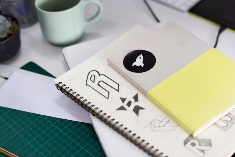
The initial process or the preparation stage in logotype design plays an important role in determining the right visual direction. It focuses not only on the visual aspects but also on understanding the concept and selecting the fundamental elements that will be used. It needs a systematic strategy to make a fundamentally strong design before coming into the exploration process and further development.
Analyzing the brief is the initial process for understanding the design needs and direction as a whole. Designers need to identify the brand’s goals, the values they should deliver, and the characters of the target audience. This information is fundamental to determining the visual mood, such as elegant, modern, or playful. With the right analysis, a logotype can represent the brand identity consistently.
Typeface curation aims to select a typeface that suits the design concept. Designers need to consider font categories such as serif, sans serif, or slab serif based on the desired visual character. Besides, the anatomical structure of letters must be considered for ease of modification. A balanced and proportional typeface will allow exploration without compromising readability.
The software selection plays a key role in maintaining the quality of the design results. Vector-based software like Adobe Illustrator allows designers to process shapes precisely and maintain visual sharpness in various sizes. The use of vector format gives flexibility in the development process and ensures the logotype’s consistency when applied to various media.
Typography exploration is the first technical stage in the process of logotype design. This step is useful for developing visual forms in greater depth. At this stage, designers begin to process letters as the primary element, considering balance, proportion, and visual character. It focuses not only on selecting letterforms but also on arranging details that affect readability and the overall impression of the design.
Type typing is the initial step in typographic exploration, involving writing the brand name using various alternative fonts. This process aims to compare the visual characteristics of each typeface. Through this step, designers can determine the most suitable letterforms with the established concept and mood.
Manual kerning manages the spacing between letters precisely without depending on automatic settings. Each letter pairing needs to be adjusted by visual balance or optical balance, not only in mathematical spaces. This adjustment is important to create a neat, harmonious, and readable logotype look.
Tracking strategy functions as the spacing manager for the overall letters in a word or phrase. Wider spacing generally creates an elegant and luxurious impression, while tighter spacing conveys a sense of strength and solidity. The tracking selection should be adjusted to the brand’s character to ensure the visual message is delivered accurately.
The second technical stage, customization in logotype design, focuses on processing letterforms to create a more unique and distinctive appearance. Designers no longer rely on the original typeface shape but instead begin to make technical modifications. This process allows each letter element to be adjusted to align with the visual concept defined in the logotype design. This procedure can be explained in the following points:
Creating outlines is the process in logotype design to change text into a vector object, allowing it to be flexibly edited. The conversion from letter format to vector allows for manipulation of each corner point or anchor point according to design needs. This step is fundamental to the customization process because it provides complete control over the letterforms.
Customizing shapes is done to change the basic form of the letter, making it look different from its real form. This technique includes cutting, elongation, or adjustment of angles in certain sections. Hence, to maintain the visual balance and readability, the modification should still be done in a measured manner.
Creating ligatures is a technique of connecting two adjacent letters to create a more unified and artistic shape. This combination applies to specific letter pairs, such as “t” and “i,” allowing it to have a more distinctive look. Further, this technique helps strengthen the logotype’s visual identity through unique details.
The finalization stage in logotype design aims to ensure that the design result is ready for various needs. In this stage, designers conduct final testing and adjustment to maintain consistent visual quality across various sizes and media. Furthermore, designers prepare color variations and the appropriate file formats for optimal logotype application.
A readability test ensures the logotype remains clear when used at various sizes. Designers can perform testing by scaling down the logo to ensure it remains legible even at small sizes. Through this testing, important details like line thicknesses, letter spacing, and character shapes should remain clearly visible. If there is a readability decrease, adjustments to the design elements are necessary.
A logotype needs to have multiple color versions to meet various media needs. A full-color version serves the primary purpose of supporting brand identity. A monochrome version ensures that the logo remains intact, even when it is not in color. Furthermore, negative space is crucial for making sure that the logotype remains clearly visible on dark backgrounds.
The choice of file format determines the flexibility of a logotype’s use. Vector formats like SVG and EPS are the requirements for designs that have scalability without loss of quality. Meanwhile, digital applications require a transparent background, such as transparent PNG format. Choosing the right format will make it easier for clients to apply the logotype across various media.
Logotype design is a process that depends on the letter selection and goes through structured stages, from research to finalization. Each stage requires careful attention to detail, such as letter proportions, element spacing, and visual consistency. This precision is what differentiates a mediocre design from a professional logotype.
The implementation of a systematic process helps designers to create a functional logotype design that can represent the brand’s identity accurately. Practice these steps on your projects to gradually improve your visual awareness and design quality.