In designing a logo, color is often the first element that attracts the audience, even before they are focusing on shapes or typography. Without realizing it, color can build the first impression, making a brand feel professional, friendly, or stand out. This is why color psychology of logo becomes a crucial aspect in the whole process of logo design.
Many designers still choose colors in their logo based on personal preferences instead of the perception one brand is seeking to build. In truth, each color brings different meanings and associations, depending on the context used.
This article will discuss how color psychology works in logo design. Additionally, we will also learn how a professional designer chooses the right colors to make the brand identity appear stronger and more relevant to the target audience.
Table of Contents
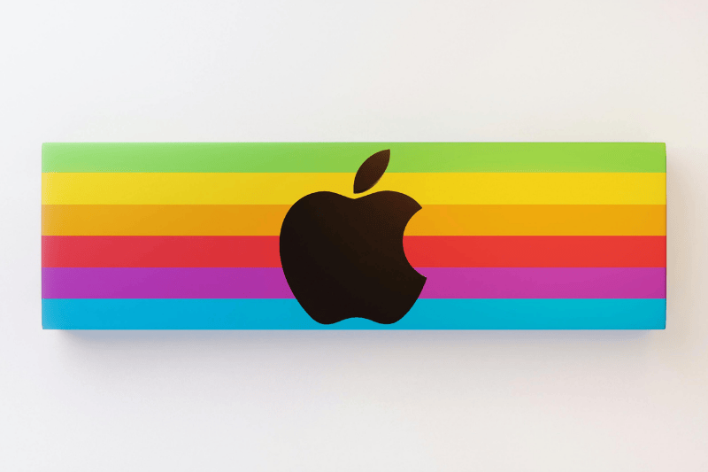
Color psychology is a study about how color affects humans’ emotions, perceptions, and responses. In the context of logo design, color does not function as a mere additional visual element; rather, it becomes a non-verbal communication tool that delivers the brand message in an instantaneous manner.
Each color has a certain association. For example, blue is often related to faith and professionalism, while red is all about energy and bravery. Without reading texts, the audience can catch the “feel” of a brand just by seeing the color.
This is the reason why color psychology is crucial in logo design. The right color selection can help build trust, enhance brand recall, and strengthen market positioning. Likewise, an inappropriate color can create a misleading perception.
By understanding this basic principle, designers can make a more strategic visual decision, not just contemplate the aesthetic.
In practice, color psychology of logo design works through perceptions that are quickly formed in the audience’s mind. Colors are not only seen but also “felt.” This is what gives colors a significant role in shaping a brand’s image at first glance.
Every color triggers emotions and affects the way people value a brand in a significantly short time. Without realizing it, color becomes the foundation for the audience to make initial decisions, including whether a brand feels reliable, captivating, or relevant to their needs.
Vivid colors tend to appeal to the audience and feel more expressive, while the darker or neutral colors are often used to build a sense of stability and professionalism. This difference forms the initial assessment, which later develops into a stronger perception of the brand’s character.
However, it is important to understand that color interpretation is not always universal. There are some factors that affect color perception, including:
As a result, in color psychology, no single color can be evaluated independently. The usage setting, customs, and culture all play a role in determining whether the color can strengthen or weaken the brand’s identity.

As previously mentioned, under color psychology, color has certain associations that can affect how a brand is perceived. However, it is important to understand that all these meanings are not absolute; they depend on the context and other color combinations in a design.
The following are some of the most widely used colors in a design logo, along with the characters that go with them:
Red is identical to energy, bravery, and urgency. This color is effective to attract attention and is often used by brands seeking to look active and dynamic. Red is commonly used in the food, retail, and entertainment industries.
Blue is associated with trust, stability, and professionalism. This is because of its neutral and acceptable impression, making it perfect for various tech industries and corporations.
Yellow represents optimism, warmth, and joy. This color is ideal for brands aiming for looking friendly and approachable, but make sure that you carefully use it to not stand out too much.
Nature, health, and green environments strongly represent the color green. Brands related to the environment, wellness, or sustainability often use this color.
Black is elegant, strong, and exclusive. This color is often used by various premium brands to create a minimalist yet classic appearance.
White commonly represents simplicity, cleanness, and balance. This color is often used as a supporting color that creates space and enhances the design’s readability.
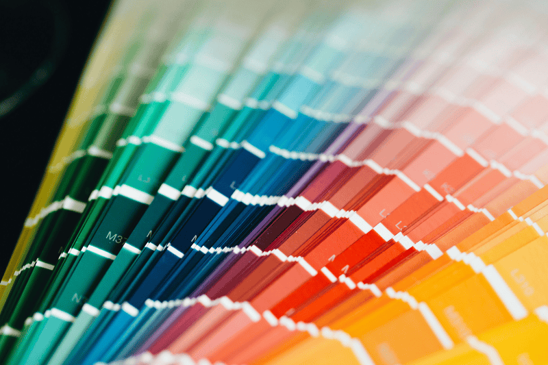
After understanding the basics of color psychology, the next step is to identify colors that are most suitable for the brands. The color choice cannot be done randomly; rather, it has to consider the brand character a brand wants to project to the audience.
The first step is to determine the main emotion a brand wants to deliver. Does a brand want to look professional, friendly, exclusive, or energetic? From here on, you can start to choose the color relevant to the character of the brand.
Next, adjust the color to the brand’s target audience and industry. An effective color for food branding may not be an ideal color for technology or financing industries. Hence, it is important to see the context, ensuring the chosen color stays relevant and does not confuse the audience.
Use one color as the main identity, and then add one or two secondary colors to strengthen the visual. Avoid using too many colors so that the logo will not be its main focus.
Finally, ensure that the color combination maintains adequate contrast so that the logo is easily readable in various sizes and media. With this approach, the use of color psychology is not only esthetic but also strategic in building brand identity.
Even if the concept of color psychology appears to be simple, many common mistakes occur in practice, particularly at the first stages of logo creation. Such mistakes cause a brand to appear inconsistent or even misconstrued.
The most common mistake is choosing a color based on personal preference rather than the brand’s intended purpose. A color selected simply because the designer likes it may not align with the brand’s character or resonate with its target audience.
Then, the use of too many colors in a single logo often becomes a problem. Instead of looking attractive, excessive combinations make the design appear unfocused and hard to recognize. Aside from that, another mistake is to utilize colors without considering industrial settings. For example, employing playful colors for a brand that should be professional can create a poor perception about the brand.
Lastly, many designers ignore contrast and readability. Colors that look appealing on a screen may not be readable in other sizes or media. Knowing all these mistakes, you will be able to avoid them and apply colors in a more effective and directed manner when designing a logo.
In designing logos, color is not just an ordinary visual element. In fact, color is an important part of the way a brand communicates with the audience. Through the color psychology approach, each color choice can help brands build perceptions, strengthen their character, and enhance the target audience’s memory toward the brand, ultimately influencing consumer behavior and brand loyalty.
The difference between ordinary and effective designs lies in the small decisions designers make about the color choice. When they choose proper and strategic colors, the logo will not only look appealing but also be able to clearly deliver the brand message.
Start understanding the meaning of color psychology and avoid the common mistakes designers made now. So, apply this principle to your next project and create a stronger and more relevant logo.
Visit Nathatype’s latest blog and find more insight and inspiration.