In a branding strategy, visual identity works as the main instrument to build the audience’s perception. Many people think a logo needs a complex symbol to be appealing. However, global companies like Google and Samsung prove that a simple logo text can be more powerful. This approach of logo creation is called a logotype, a visual identity that focuses entirely on typography as the primary element.
In 2026, the use of logotypes will become more relevant in line with the increase in adaptive minimalistic design needs. A brand can communicate its identity directly and consistently across digital media without being distracted by icons.
This article will discuss how a logotype becomes a strategic selection for many big companies. The discussion focuses on how to differentiate it from other types of logos, its technical advantages, and the psychology of typography. Read through to the end to determine the most appropriate visual identity for your business.
Table of Contents
To determine the right visual identity, you have to understand the basic classifications in logo design. You can observe the fundamental difference in a logo through the use of visual elements. The mistakes in choosing a category can impact the effectiveness of brand communication. Here are the technical differences between the four types of logos frequently used by large companies:
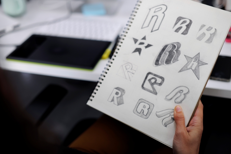
A logotype is a visual identity that uses typography as one of the communication elements. In this logo, the brand name functions both as text information and the main graphic asset.
Different from a logotype, a logomark only uses symbols, icons, pictograms, or graphic pictures to represent an identity. In practice, a logomark often contains no text at all.
This type of logo combines text (logotype) and a symbol (logomark). New brands widely use combination marks, the most flexible type of logo.
As one of the variations of a logotype, a lettermark focuses on a company’s initials. This type of logo is one of the technical solutions for companies with long names that are difficult to display on a single line.

Choosing a logotype as the main identity gives long-term competitive advantages. Here are some of the reasons why many big companies choose to use pure typography over symbols.
In the marketing field, the biggest challenge is to make the audience remember the brand’s name. With a logotype, the audience doesn’t need to translate the symbol’s meaning; they can simply read and memorize it. The company name and visual identity are one, which minimizes the risk of a “mistaken identity” that often occurs with less popular symbol-based logos.
A logotype tends to have a better performance in various media sizes due to its focus on text. Designers can easily adjust the legibility, both in print and digital media, as on small smartphone screens. On the other hand, complex symbols often lose detail when scaled down. Meanwhile, a well-designed logotype will be easily recognizable across media sizes without losing detail.
Technically, a logotype is easier to apply in various production techniques, from embroidery and graphic printing to three-dimensional signage (letter signs). Furthermore, logos with text tend to be cheaper and quicker to produce than symbols with extensive graphic detail or color gradation.
Typography that has precise detail tends to have a more timeless feel than an illustration or symbol. History proves that many legendary brands rarely rebrand their logos over decades. A logotype gives strong authority, stability, and professionalism to the audience.
To create an iconic logotype, a designer should pay attention to every little detail in the letters. The following elements are the determining factors in whether a logotype looks professional or amateurish:
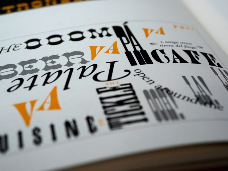
In the process of creating an iconic logotype, selecting the right font type becomes fundamental. This is due to the different psychological upbringing associated with each font style. Here are some of the example fonts with their characteristics:
Serif fonts have distinctive characteristics, such as feet or tails at the ends of letters. This type of font often relates to tradition, elegance, and a well-established reputation. Some of the brands that use serif fonts are Rolex, Vogue, and Tiffany & Co.
This type font has no tails or serifs at the ends of its letters. The consistent thickness gives a clean, efficient, and progressive impression. These characteristics make it suitable for tech and startups that prioritize high readability on digital screens, such as Facebook and Microsoft.
Slab serif is a derivative of serif but with thick, stiff, and square block-shaped tails (serifs). While serifs are typically elegant, slab serifs project a much bolder, more masculine, and stable impression. Brands like Volvo, Honda, and Sony use slab serif fonts in their logotypes.
This type of font resembles human handwriting, in both formal and casual styles. Brands like Pinterest and Instagram choose script in their logos to emphasize personal style, creativity, and exclusivity.
Visit NathaType to explore various fonts, starting from classic serif and modern sans-serif to playful script.
A logotype is a powerful strategy for brands, enhancing their image with clarity and efficient communication. By using typography as the primary identity, a brand can instantly make its name recognizable without the visual distraction of additional symbols.
The power of a logotype lies in its technical details, from font selection to precise lettering. A well-designed identity will not only look professional but also be long-lasting and functional across digital and print platforms. Investing in the right typography is a long-term investment in your brand’s authority and sustainability.