A display serif font is a type of font designed to create a bold, distinctive, and memorable impression in a wide range of design projects. Choosing the right font can significantly influence how audiences perceive a brand, product, or message. That is why many premium brands, magazines, and creative campaigns rely on display serif fonts to enhance their visual appeal and strengthen their brand identity.
However, achieving the best results requires understanding where and how this type of font is most effective. In this article, we will explore the best use cases for display serif font styles, discuss why they remain so popular, and share practical tips for using them effectively to create professional, visually appealing, and memorable designs.
Link of font demo: Click Here
Table of Contents
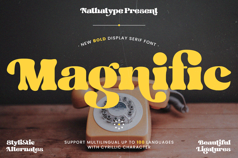
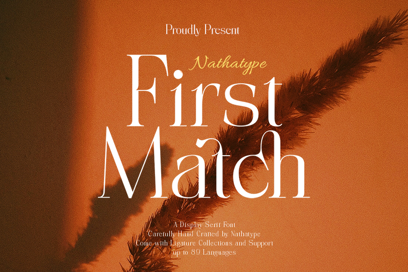
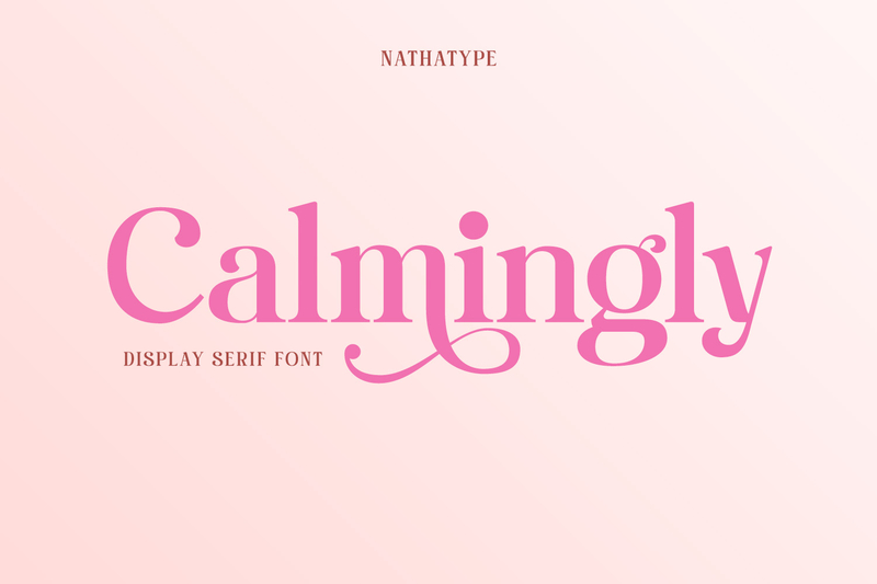
A display serif font is a type of font specifically designed for large-format applications, such as headlines, titles, logos, posters, and other prominent visual elements. Compared to serif fonts intended for body text, display serif fonts typically feature more decorative and expressive letterforms. Their distinctive serif details, unique proportions, and pronounced stroke contrast make them highly effective for drawing attention and serving as a focal point in a design.
Link of font demo: Click Here
Amidst the modern design trends with their clean and minimalist font styles, using a display serif font is still a go-to choice for many designers in various creative projects. The distinctive letter character of this type of font allows designers to create a striking appearance while strengthening the visual identity at the same time. The following are some reasons why using a display serif font is still a favorite choice.
Display serif font styles are designed with more expressive and distinctive letterforms than fonts intended for body text. Their eye-catching appearance naturally draws attention to key elements such as headlines, titles, and primary messages. As a result, they are widely used to enhance visual impact and create a stronger focal point across various design projects.
Many brands use a display serif font for their branding to build a positive perception of quality and exclusivity. The distinctive serif details can evoke a classy nuance compared to neutral types of fonts. These characteristics make a display serif font a popular choice, especially in fashion, cosmetics, jewelry, and other premium industries.
Each display serif font has different visual characteristics; they can be classic, formal, modern, or artistic. These variations provide designers with the flexibility to adjust the visuals according to the project’s needs. As a result, the design will both look distinctive and have a clear visual identity.
Typography is one of the most essential elements in a brand’s visual identity system. The use of a proper display serif font will certainly help create visual consistency as well as strengthen the intended image. With sustainable usage, the audience will also easily recognize and remember the brand.
The evolution of typography has introduced a wide variety of display serif fonts that blend classic elegance with contemporary design elements. This combination makes them highly versatile and well-suited to modern design needs. Whether used in print or digital media, a display serif font can create a visually appealing and relevant look that resonates with today’s audiences.
Although very flexible, there are certain types of design projects that are the best places to take advantage of the beauty of display serif fonts.
Link of font demo: Click Here
A display serif font is useful in branding, especially for premium product branding, because of its distinctive letter details that can create a personalized visual identity. The letterforms are elegant, helping to build the perception of quality, exclusivity, and reliability for a brand. This font is effective when applied in a logo, packaging, promotional materials, and products seeking to appear premium.
In the editorial design, a display serif font can definitely strengthen the visual appeal, especially when used in titles or a page’s key element. The strong contrast and character of this type of font help create the information hierarchy, allowing readers to find the focal point of the content more quickly. Furthermore, this font’s expressive appearance often makes it a popular choice for magazine covers, article headlines, catalogs, and creative publications.
Using a display serif font is incredibly ideal for posters and creative campaigns because of its ability to attract the audience’s attention in a short time. The unique letter character helps make the main message standout among other visual elements. Aside from enhancing the visibility, this type of font also supports the intended atmosphere and theme of the design.
In typography-based logos, a display serif font helps create a recognizable identity and strong character. The distinctive letter details also add differentiation value, making a logo appear more unique compared to the competitors. Moreover, the use of this type of font also strengthens the brand image, enhancing the appearance to be more professional, classy, and appealing in the long term.
In social media, a display serif font can help content stand out more when competing with other visuals in users’ feeds. The intriguing letter style makes the message even easier to understand as well as improve the design’s aesthetic quality. This combination creates a clear typography contrast, enabling easy comprehension of essential information without compromising design quality.
Many designers use a display serif font to create packaging designs that leave a strong visual impression on consumers. The elegant characters of this type of font help deliver the quality, distinctive image, and brand value more effectively. The proper use of typography can make a product feel more appealing and stand out when put together with other products on a shelf.
Although display serif fonts have a powerful and refined visual character, their use should be carefully tailored to the design environment. In some cases, fonts that emphasize readability and functionality are the most effective option to convey information to the audience.
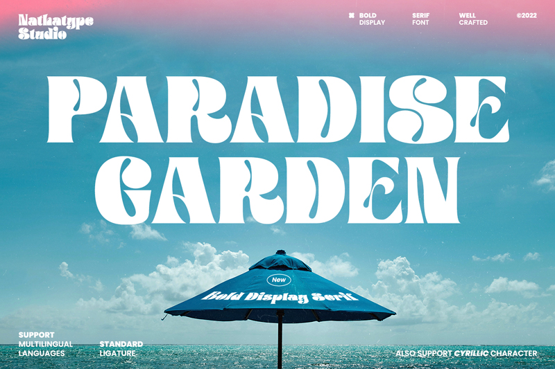
Link of font demo: Click Here
Designers should avoid the use of a display serif font in a long paragraph because its decorative details can reduce reading comfort. For articles, books, or content with many texts, fonts that are specifically designed for body text will be a better choice, as they can maintain excellent readability.
Display serif fonts are less ideal for small-sized text because the serif details and the distinctive characters will be difficult to see. To maintain the beauty and optimality of the characters, designers tend to use a display serif font in large sizes.
UI/UX designers typically use a simple font that is readable for the dashboard, application, or website with UX as the priority. The fonts that focus on readability help users find and comprehend information much quicker in an efficient manner.
Writers and designers normally avoid the use of a display serif font in technical documents that need a high readability level. This type of font is simpler and functional, helping readers to process and understand information more easily.
To ensure the font you use can give an optimal result, designers should use it properly according to the function and design context. The following are some tips to help you leverage a display serif font more effectively.
The use of a display serif font in a standout area will help strengthen the visual focus as well as make the design message more visible. This type of font is designed to attract attention, and thus, it perfectly works for headlines, titles, or a design’s main elements.
Designers often combine serif fonts with sans serifs to create a better visual harmony. The combination of the two can result in an appearance that is elegant, modern, and comfortable to read.
The proper setting of letter and line spacing can help make a font look neater and more professional. The balanced spacing also helps make the letter character look clearer without sacrificing design aesthetics.
It is better to use a display serif font in elements that prioritize the most essential information, such as headlines or main titles. The proper placement of this font helps the audiences understand the information hierarchy more easily. With a clear visual hierarchy, designs will look more structured and effective in delivering the message.
Designers need to carefully choose the font that is suitable for both the brand identity and target audience. The font selected should be able to strengthen the visual message as well as create a consistent impression of a brand.
Although display serif fonts can make a design more visually appealing and full of character, using them incorrectly can diminish their impact and effectiveness. Here are some common mistakes designers should avoid when using a display serif font in their work:
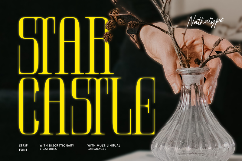
Designers should avoid using too many decorative fonts within a single design, as this can make the overall composition appear cluttered and overwhelming. Using fonts thoughtfully helps create a more cohesive, balanced, and visually appealing design while ensuring the message remains clear and easy to understand.
Designers cannot focus only on aesthetics without considering the font’s readability. A font should not only look appealing but also be able to deliver information clearly to the audience. The balance between aesthetics and functions becomes one of the most important principles of effective typography.
Fonts will work more effectively if used in a selective manner, especially in elements you intend to highlight. The excessive use can reduce the visual focus and make a design feel less balanced.
Designers need to combine fonts to ensure that the design looks more professional. Combining some decorative fonts at the same time often makes a design look less neat and difficult to comprehend.
Designers should maintain the consistency of typography they use to build a strong and recognizable visual identity. Changing fonts so often will make a design look less professional and confuse the audience.
Using a display serif font is one of the most effective ways to create a visual focus that strengthens the identity of a design. The distinctive letter characters make this type of font perfect for various design needs, including branding, editorial designs, logos, posters, social media content, and product packaging. By understanding the usage context, designers will be able to optimize the function of fonts they use without sacrificing readability or the audience’s visual experience.
In the end, the successful use of display serif fonts lies not only in the appealing letterforms but also in the designers’ ability to place them in the right way and time. When combined using a proper typography strategy, this font can help deliver messages more clearly and strengthen the impression of the design.
By choosing the proper display serif font that is tailored to the project purpose, target audience, and brand character, you can create a design that is not only more consistent but also more professional and has a more effective visual appeal.