Have you ever been instantly drawn to a brand just by its logo? Or have you ever suddenly felt hungry just by seeing a certain color combination? This is no coincidence. According to logo psychology, the human eye processes visuals much faster than the brain processes words.
In seconds, a logo’s shape, color, and composition send emotional signals to our brains. This is why a logo can trigger feelings instantly, from trust and enthusiasm to the urge to buy.
A logo is more than just an aesthetic element but a visual communication tool that works directly on a subconscious level. Unfortunately, many still consider logo design merely a matter of taste or following trends. However, behind an effective logo lies a powerful application of perceptual psychology that influences how audiences perceive, understand, and interact with a brand.
Understanding logo psychology is an important thing for creating brand identity that is visually aesthetic and capable of building emotional connections with the consumers. It can also increase consumers’ trust and create long-term loyalty to the brand. Want to know how shapes, colors, and other visual elements can influence the consumers’ emotions? Let’s find out in this article and open the secret behind an effective logo design.
Table of Contents
In logo psychology, shape is the first element that can influence the audience’s perception. Without reading the text, a human’s brain can automatically define a shape as an emotional symbol and brand character. Here are the meanings of various shapes that are commonly used in logo design:
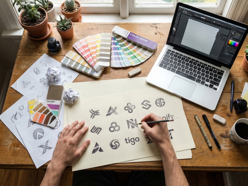
Circles, ovals, and ellipses symbolize friendship, love, unity, and warmth. These shapes feel soft, secure, and inclusive because they lack sharp corners, making them often used by brands seeking to appear friendly and open. From a logo psychology perspective, circles reflect continuity and harmonious relationships, making them suitable for community brands or businesses seeking to appear friendly and open.
Squares and rectangles represent stability, efficiency, and professionalism. Their sharp angles create a sense of structure and reliability. Therefore, financial institutions and large corporations often use these shapes to visually build trust.
Triangles have a bold and dynamic visual character, creating an energetic impression while also being synonymous with strength, direction, and ambition. An upward-facing triangle symbolizes stability and growth, while an inverted triangle conveys a sense of dynamism and challenge. Because of its strong and directional nature, this shape is often used in logo psychology to create a bold and innovative impression.
Lines play a crucial role in logo psychology because they directly shape visual impressions. Vertical lines convey strength and dominance, while horizontal lines convey calm and stability. The combination of the two creates a harmonious visual balance that the audience easily understands
With understanding shape’s role, designers can create a logo that is visually aesthetic and capable of conveying the brand’s message accurately, quickly, and emotionally.
One of the important elements in logo psychology is color, because it can influence consumers’ emotions and decisions in the matter of seconds. This happens even before the shape is recognized; color is often the first element the eye catches. Hence, color selection in a logo is not just a matter of aesthetics but also a visual communication strategy.
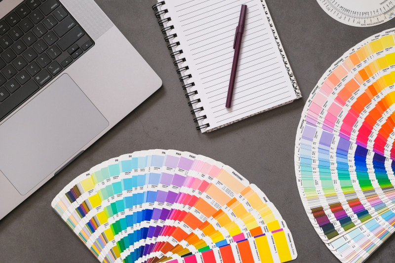
Red is the key role in increasing energy, attracting attention, and triggering a quick response. On the other hand, yellow presents a cheerful, warm, and appetizing impression. The combination of these two colors often takes part in the food and beverage industry because it can stimulate appetite and create high interest. Through the logo psychology approach, this combination becomes a strong visual strategy to attract consumers’ attention instantly amidst the high competition.
Blue is identical to trust, safety, and professionalism, making it able to present a calm and stable impression. It is no wonder that many tech brands and banks use it to build consumers’ trust. In logo psychology, blue can help brands look credible, dependable, and secure.
Green has a close relation with nature, health, and development, giving a fresh, balanced, and eco-friendly impression. In logo psychology, green often becomes the key role in emphasizing an eco-friendly, organic product or healthy lifestyle concept. Moreover, it also creates a calm and comfortable feeling for the audience.
Black represents strength, luxury, and exclusivity, while white reflects simplicity and cleanness. The combination of both creates an elegant, modern, and timeless look. In logo psychology, brands often use black and white to give an authoritative and high-class impression.
By understanding the psychology of colors, brands can build a stronger emotional connection, effectively attract attention, and enforce a consistent visual identity.
Gestalt principles are a psychological theory that explains how humans tend to perceive and understand visual elements as a whole, not as separate parts. From the logo psychology perspective, this principle helps explain how the human brain organizes visual elements as meaningful shapes. Thus, the audience can understand the visual message more quickly and intuitively.
The brain tends to group elements that are close together (proximity) or similar (similarity) into a single unit. In logo design, this principle helps bring small elements together to create a neat and cohesive look, making the visual message easier to grasp without feeling cluttered.
This principle allows the audience to still recognize the shape of a logo design even if it’s not completely drawn, because the human brain is naturally able to fill in the missing visual elements. This technique is often used to create simpler yet still appealing logos, such as the Apple logo.
This principle plays on the relationship between the main object (figure) and the background (ground). By utilizing negative space, designers can create double meanings or hidden messages, making logos feel more creative and memorable.
By applying gestalt principles, the design not only looks attractive but also more effectively conveys its message visually. This makes the design more effective in creating a strong and memorable psychology logo.
In the world of modern branding, understanding logo psychology is key to creating a strong visual identity. Effective logo design isn’t born from simply following visual trends but from a deep understanding of how humans perceive, feel, and respond to a logo design. Every element of a logo design, from shape and color to composition, plays an important part in determining the audience’s perceptions and emotions.
A logo designed with a psychological approach is far more powerful because it communicates instantly. This is what makes a brand more recognizable, trustworthy, and memorable in the long term. Ultimately, a great designer isn’t just an artist who creates compelling visuals but also a visual psychologist who understands how every detail can influence how people think and feel.
Now, take a look at your logo! What emotion first arises when you see it? Does it accurately reflect your brand’s identity and message? Also, read the logomark article to further your understanding of one of the logo types frequently used by major brands.