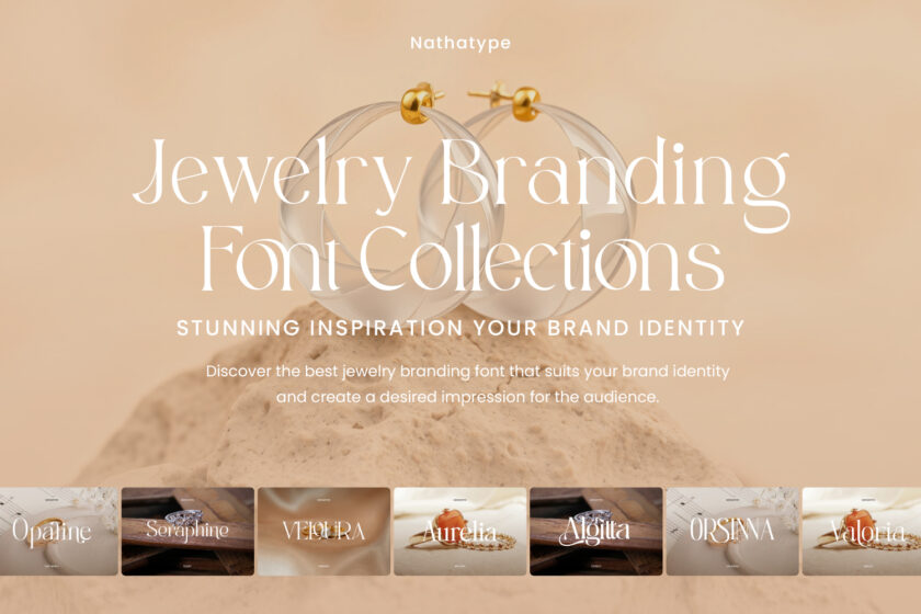
In the jewelry industry, visual branding has a crucial role in creating a strong first impression. The brand’s nuance and impression come through the design elements, especially with the right typography selection. Moreover, a jewelry branding font helps build a characterized brand identity. The typography selection serves not only as a text element but also as a representation of the brand image’s value that the brand wants to convey.
Each font type conveys a distinct character, ranging from classic to modern to exclusive. Therefore, using the right jewelry branding font can enhance the visual impact and the brand’s appeal. Furthermore, choosing the right font also helps differentiate a brand in an increasingly competitive marketplace.
Through a proper understanding of typographic characteristics, designers can choose fonts that align with their brand concept. This article presents jewelry branding font recommendations based on their visual characteristics, which enhance an elegant and luxurious feel. This selection can serve as a reference for improving overall branding quality.
Table of Contents
Link of font demo: Click Here
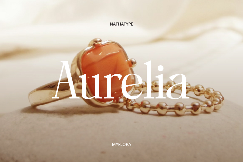
This font showcases a modern serif with a slender and smooth contrast, giving a classy feel to the design. The balanced letter proportion keeps the look neat and professional. The uniqueness lies in its thin serif detail that gives a refined touch without excessive ornament. Therefore, this characteristic makes Myflora a jewelry branding font that can strengthen a luxurious, exclusive, and professional image in logos or other branding elements.
Link of font demo: Click Here
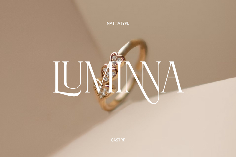
The next font in this list is Castre. It presents an expressive visual style through elongated letterforms and subtle curves on some characters. The letter structure is dynamic yet controlled, creating an artistic and sophisticated look. The uniqueness of this font lies in its flowing curve details and playful proportions, which create an exclusive feel. Castre is perfect for those seeking a bold, luxurious look with a strong visual identity.
Link of font demo: Click Here
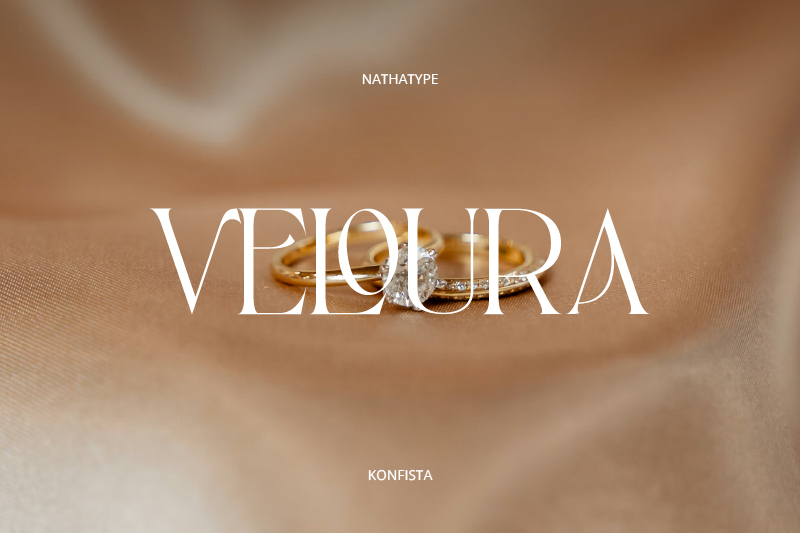
Next, there’s Konfista, which features a neatly structured serif font, creating a stable and authoritative impression as a jewelry branding font. The contrast between the soft, serif-like lettering and the sharp yet refined edge details creates an elegant yet clean look. Konfista’s uniqueness lies in its balance between professionalism and elegance, creating a strong visual character without losing its exclusive feel.
Link of font demo: Click Here
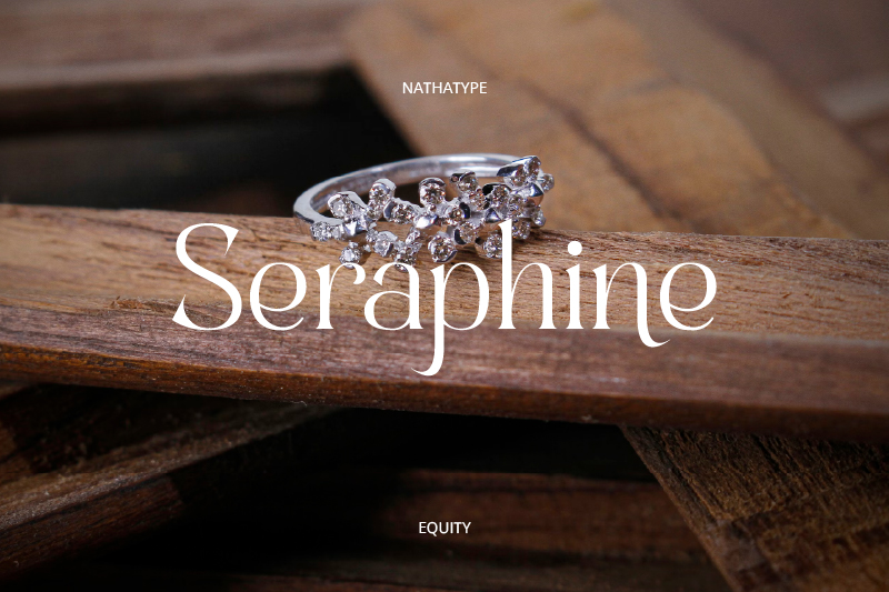
Change your choice to this font that emphasizes the serif characteristic with a wider and more open letterform. These characteristics give a light yet elegant feel as a jewelry branding font. Some of the serifs look gently flowing, creating a more flexible visual rhythm yet still feeling classy. Moreover, the wide and spacious spaces between letters make Equity relevant to modern branding.
Link of font demo: Click Here
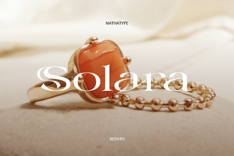
The Repath font’s character has nuances that feel more expressive and artistic than its predecessor. The letterforms convey a relaxed, elegant feel, making them appear more vibrant and dynamic. Its uniqueness lies in the flowing letterforms and the characteristic swash details, such as those in the letter “S,” which create a distinctive visual identity. This character makes it suitable as a jewelry branding font for brands seeking a luxurious, decorative touch.
Link of font demo: Click Here
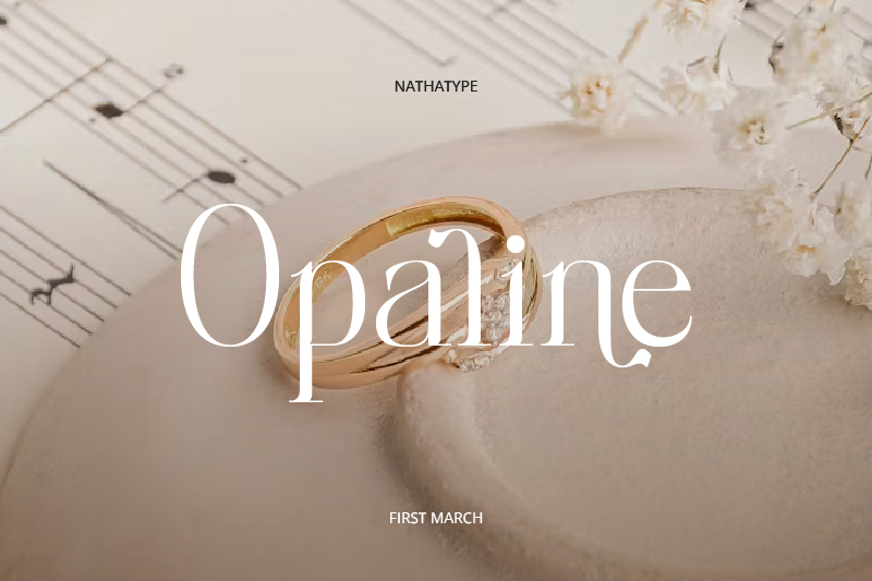
First March uses an approach that emphasizes soft serif letterforms and spacious, harmonious proportions. The letterforms appear light with smooth flowing lines, creating an elegant impression as a jewelry branding font. ’This font’s uniqueness lies in its subtle curved details and balance between characters, thus creating a luxurious and classy brand image.
Link of font demo: Click Here
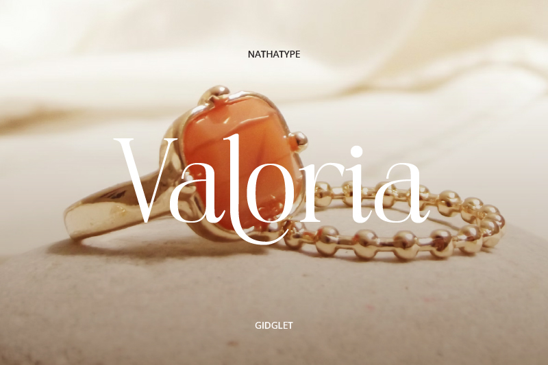
Visually, the Gidglet font showcases the serif character with slender and firm line contrasts, making it look structured. The unique detail in Gidglet lies in the pointy tip of the serif and the gentle curve in some of the characters. This characteristic is a combination of sharpness and visual smoothness. Additionally, the slender letter proportion and controlled distance between the letters result in a jewelry branding font that looks neat and modern.
Link of font demo: Click Here
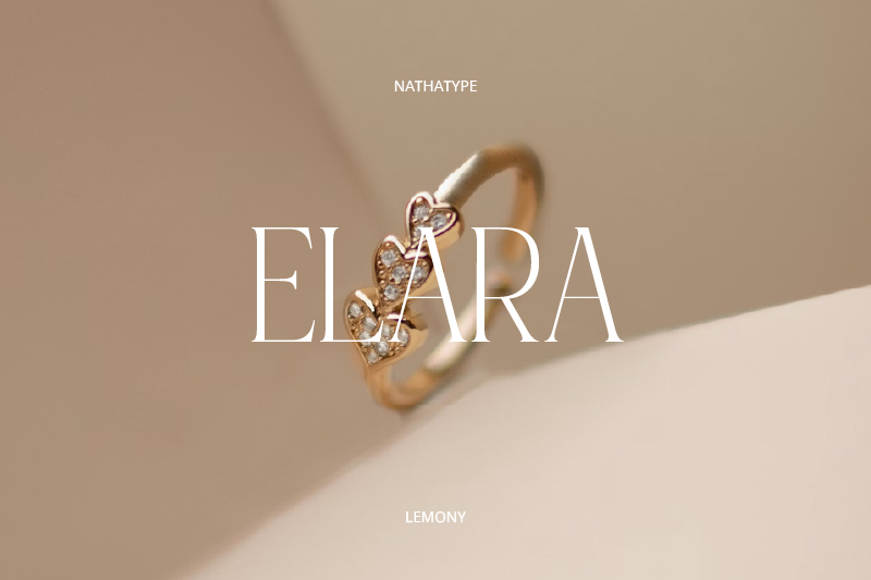
In terms of form, this font has a lighter and more decorative weight, creating an elegant impression that feels soft and not excessive. The letterforms appear flexible with subtle curves that create a graceful feel. Lemony’s uniqueness lies in its pointed terminal details and dynamic letter rhythm. Thus, it creates an attractive yet classy visual identity suitable for a jewelry branding font.
Link of font demo: Click Here
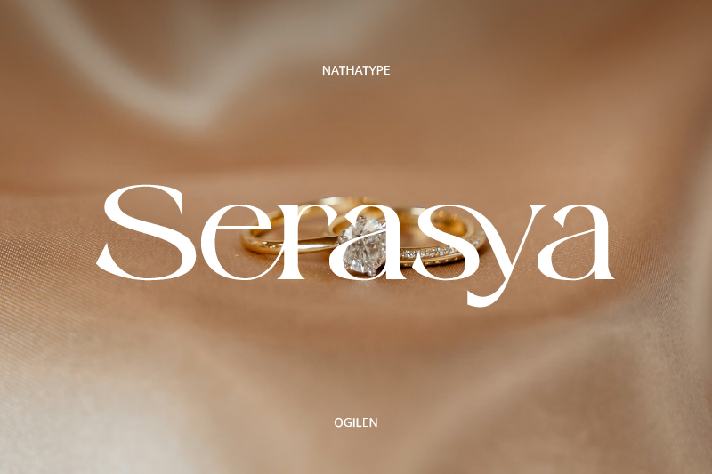
The Ogilen typeface combines classic serif shapes with bold modern touches. The letterforms tend to be stable in proportion, with clean lines and dynamic contrast, creating a neat and elegant look. Ogilen’s uniqueness lies in its interconnected ligature sets, creating a more harmonious and unified visual flow. This character makes it suitable for jewelry branding, which emphasizes luxury and authority.
Link of font demo: Click Here
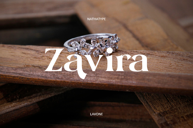
The typography structure in this font showcases a graceful visual expression with a highly prestigious touch in the context of jewelry branding. Each letter has a bold letterform and firm serif, creating a harmony between elegance and boldness. Moreover, Lavone exudes a contemporary, classic aura that enhances the brand’s image, making it an ideal representation for highlighting the brilliance, refinement, and fine jewelry collections.
Link of font demo: Click Here
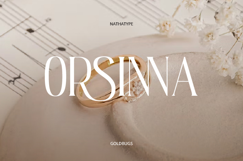
Unlike the previous font, Goldbugs offers tall, slender serif letterforms with a more directed composition. It has a clean appearance with well-maintained contrast, creating a strong and structured visual impression. Its uniqueness lies in its prominent vertical proportions, thin and precise serif details, and various artistic ligatures. This character can build a modern, exclusive, and easily recognizable visual identity for branding purposes.
Link of font demo: Click Here
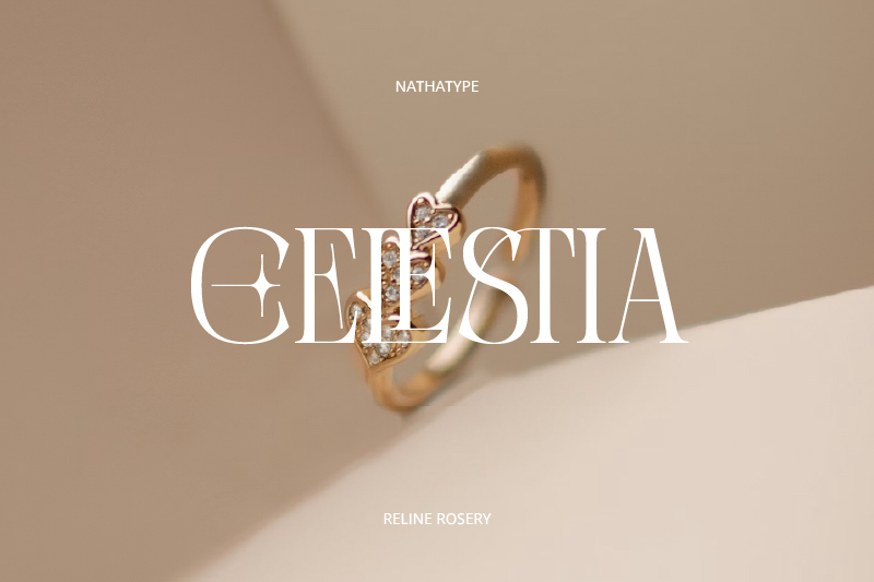
Next is Reline Rosery, a font that emphasizes the serif character with a decorative touch in some of the letter parts, presenting a distinct nuance of a jewelry branding font. The shape remains structured, but it’s complemented by unique details like additional lines and fine cuts that create a more artistic look. Therefore, these ornamental elements add character and elegance to Reline Rosery.
Link of font demo: Click Here
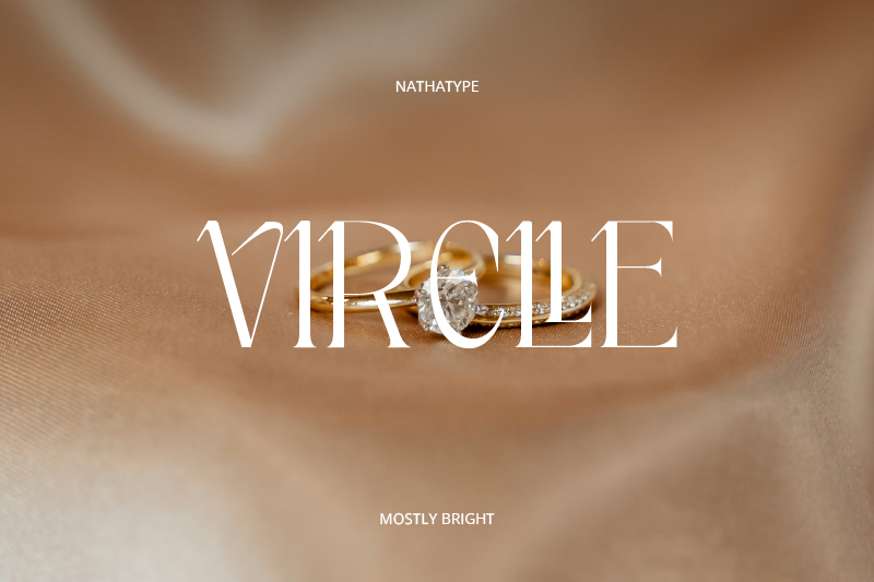
With its sleek shape and striking contrast, Mostly Bright features an elegant and clean font. Its unique serif shape sets it apart from most serif fonts, creating a distinctive look as a jewelry branding font. Consistency of form and spatial balance are Mostly Bright’s main strengths, with additional features like swashes and ligatures making this font increasingly popular among designers.
Link of font demo: Click Here
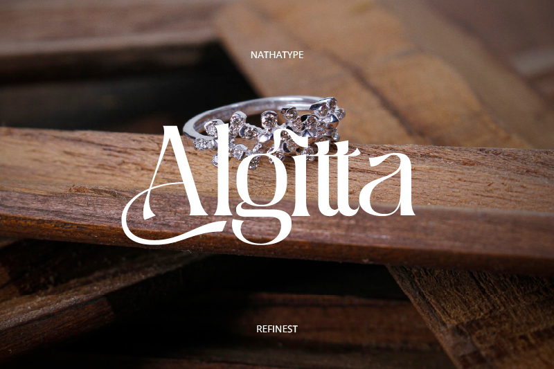
This font presents characters with expressive decorative touches through flowing curved details on several letters. The shape remains structured but is enriched with swash elements that add an artistic touch. Refinest’s uniqueness lies in its blend of classic elegance and dynamic accents, resulting in a striking appearance. This character is suitable for use as a jewelry branding font for brands seeking a luxurious and distinctive look.
Link of font demo: Click Here
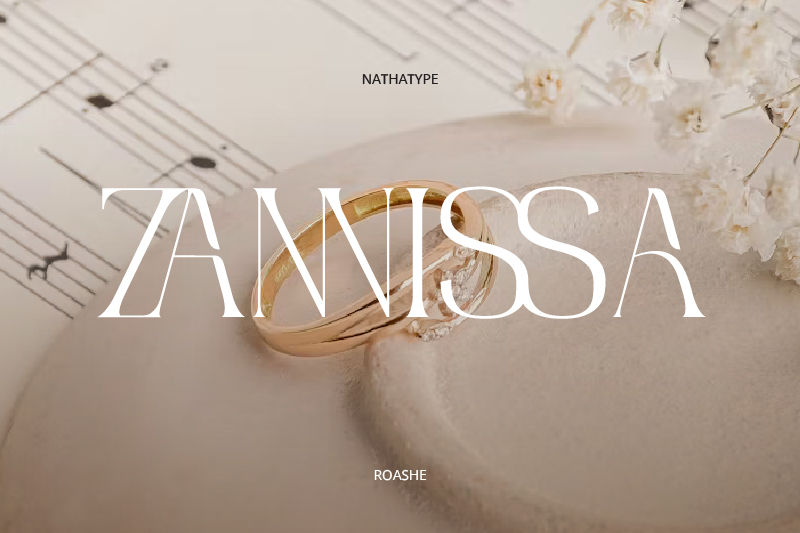
Last on the list, we have Roashe. This font showcases a visual character in the form of bold letterforms with stable, measured proportions. Its lines appear clean and contrast well, creating a neat and classy look. Roashe’s uniqueness lies in its balance between bold form and visual simplicity, creating a strong identity. This character is suitable for brands seeking to appear elegant, professional, and trustworthy.
Overall, a jewelry branding font plays a crucial role in establishing an elegant and distinctive visual identity for jewelry brands. Each font has its characteristics, including letterforms, uniqueness, and visual composition. The right typography selection can enhance the design’s appearance and strengthen the brand’s image, making it appear more professional, consistent, and recognizable.
Therefore, it’s crucial to choose a branding font that aligns with the brand’s concept and character. You can find a variety of quality font references by visiting font provider platforms, which offer a diverse range of typography for optimal branding needs.