In the graphic design world, selecting typography combinations has an important role in shaping a strong visual character. One of the approaches that can be implemented is pop art font pairing. This approach combines an expressive, bold, and colorful font style with a readable, neutral typeface. Moreover, it also functions to strengthen information hierarchy, where decorative fonts are used as attention grabbers while supporting fonts maintain the clarity of the message being conveyed.
Font pairing emphasizes not only a striking appearance but also a balance between decorative elements and readability. Pop art fonts generally have unique, dynamic, and characterful shapes. Therefore, they require supporting font pairs that maintain clarity and layout consistency.
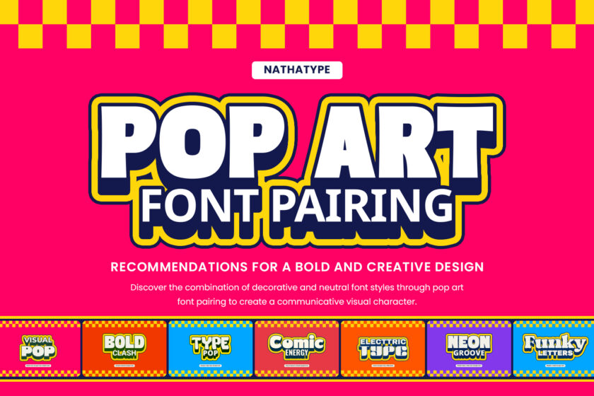
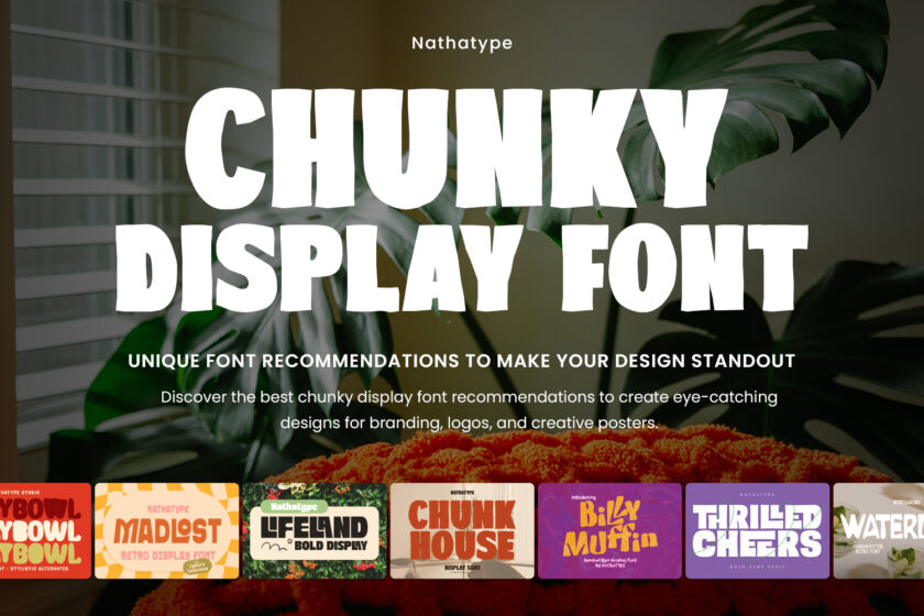
This article offers pop art font pairing recommendations that can be implemented in various design needs, such as posters, branding, and digital media. Each font pairing has a function to showcase the combination of decorative and supporting fonts that can give a dynamic, communicative, and professional visual.
Table of Contents
Link of font demo: Click Here
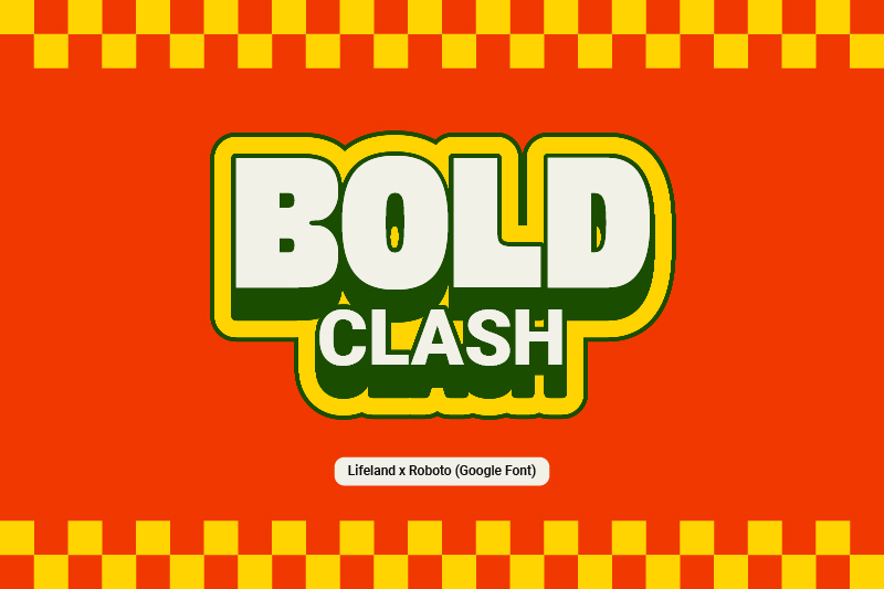
Lifeland presents an expressive pop art style, featuring a bold, dynamic, and decorative letterform. Its playful and bold appearance makes it effective as the main element in attracting attention and building a strong visual identity.
As a supporting font, Roboto from Google Fonts offers a neat and readable modern sans-serif style. Its neutral character helps balance Lifeland, resulting in an attractive, communicative, and professional pop art font pairing.
Link of font demo: Click Here
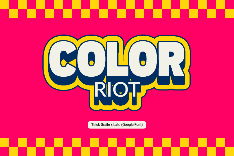
The Thick Graile presents a bold, solid, and wholesome image under strong visual pressure. This font has a decorative and attractive ligature variation, adding a unique appeal. With its strong, bold, solid form, this font is effective as a central element in pop art-style designs.
Meanwhile, Lato from Google Fonts complements Thick Graile with a cleaner, more modern feel through its simple sans-serif style. The stable letter proportion and high readability make it the perfect partner to balance the pop art font pairing that is both eye-catching and easy to understand.
Link of font demo: Click Here
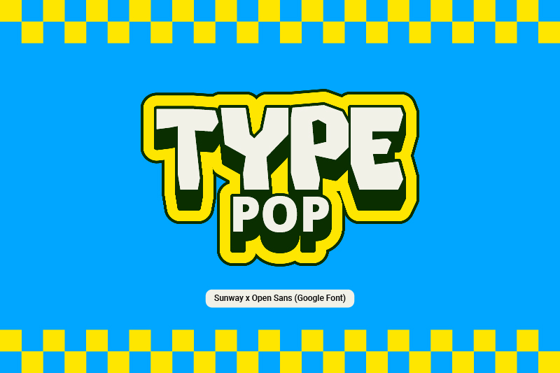
Sunway presents a distinct typography style through its flexibility, contrast, and fullness of visual expression. Its striking characteristic and flexible composition give a vibrant and attractive impression. Therefore, it is perfect as the main element in pop art-style design.
On the other hand, Google Fonts’ Open Sans offers a more functional approach through simple and consistent forms. Its high readability and stable letter proportions make it a perfect match to balance the Sunway character. This combination creates a pop art font pairing that offers an engaging visual appearance without compromising clarity.
Link of font demo: Click Here
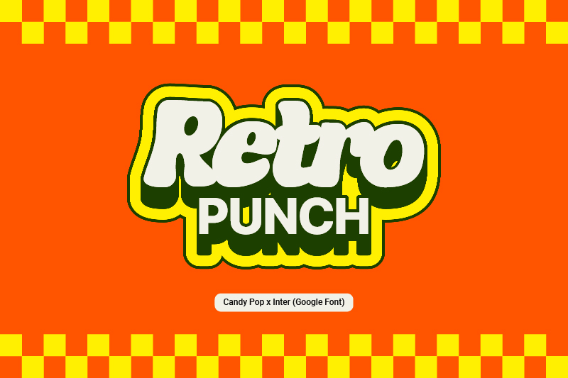
Candy Pop has rounded, bold, and decorative characteristics with a cheerful feel. The gentle form and playful visual style give a light and attractive impression. Thus, it strengthens the expressiveness of the design appearance.
On the other hand, Inter from Google Fonts presents a modern, simple, and readable sans-serif. Its neat and consistent letter structure balances the dominant Candy Pop’s appearance. This combination then results in a balanced pop art font pairing that is visually attractive and still supports the information clarity.
Link of font demo: Click Here
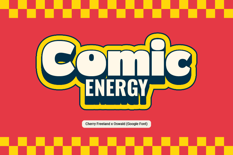
The use of Cherry Freeland in a design offers a more playful approach with its bold letterform. Its strong and dynamic visual character adds a vibrant nuance and highlights the main appeal in a pop art-style design composition.
To balance Cherry Freeland, Oswald from Google Fonts gives a slim, structured, yet bold sans-serif. Its vertical letter proportion and good readability level make Oswald an ideal pairing for Cherry Freeland. As a result, this pop art font pairing gives a contrasting, dynamic, yet clear pop art font pairing.
Link of font demo: Click Here
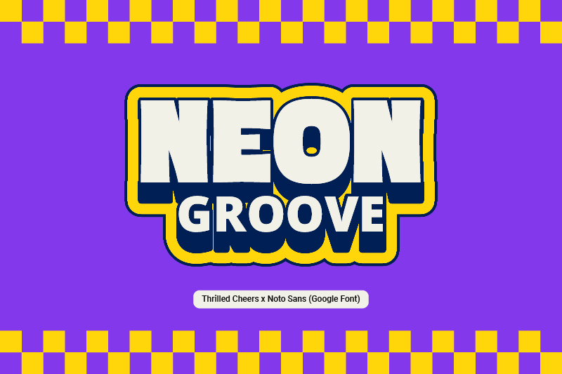
Thrilled Cheers features solid letterforms with a bold, decorative style. Besides its liveliness and boldness, it creates a strong visual impact while also conveying a pop art feel.
On the other hand, Noto Sans from Google Fonts offers a more functional typographic approach through its measured sans-serif form. The consistent letter arrangement and good legibility help maintain a clear flow of information. This pop art font pairing is suitable for posters, product packaging, social media content, and promotional materials, offering a strong and communicative visual appeal.
Link of font demo: Click Here
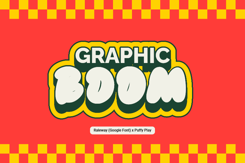
Puffy Play offers a light visual nuance through its rounded, bold, and bubbly letterform. This style creates a flexible and fun impression that strengthens its expressive design characteristic. Even though it looks flexible and playful, this font can create a strong and striking appearance.
Google Fonts’ Raleway complements the font by presenting a structured, streamlined, and proportional look. The modern, clean feel of the letters helps maintain clarity in the visual composition. This combination creates a dynamic, organized, and effective pop art font pairing for use in a variety of design mediums.
Link of font demo: Click Here
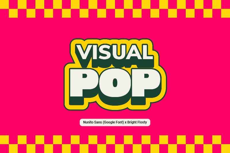
As the main visual element, Bright Flosty presents a bold, rounded, and striking letterform. The uniqueness lies in its solid letter structure and soft decorative touch, creating a flexible impression that strengthens the pop art nuance.
Nunito Sans, as Bright Flosty’s pairing, complements the composition with a simple and clean style. Its letter proportion gives a firm and organized feel, balancing Brightly Flosty’s characteristics while maintaining visual comfort in designs.
Link of font demo: Click Here
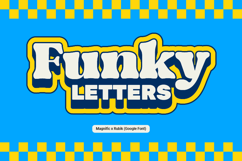
Magnific gives a bold serif style with a more casual and playful approach. Its visual character feels more artistic and expressive, strengthening the visual impression in pop art-style designs.
To support Magnific, Rubik presents a more systematic typography approach through a clean and geometric sans-serif. The neatness of the letter structure and consistency between elements help create an organized look. These two fonts create a vibrant, organized, and effective pop art font pairing that conveys a visual message.
Link of font demo: Click Here
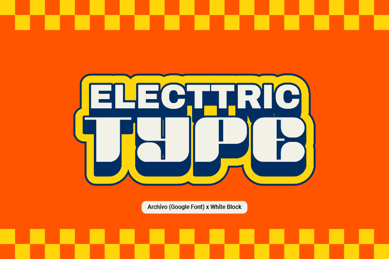
White Block and Archivo form a striking pop art font pairing with strong typographic composition. White Block gives a solid letterform with a high contrast and an attractive artistic form. Its massive and expressive letter structure makes it effective as a focal point in a design.
On the other hand, Archivo offers a more rational approach through its simple sans-serif. Its stable letterform helps balance the White Block’s domination. As a result, this combination produces contrasting and directed typography while maintaining visual communication clarity.
Pop art font pairing is a typographic design technique that combines decorative and neutral fonts to create an attractive and communicative visual. Each font pairing has its own character that can strengthen design identity. When looking for the perfect combination, designers should explore a range of pop art font pairing suggestions. The correct combination allows designers to craft visually appealing and distinctive works.