When each element in a design has equal visual strength, it blurs the focal point and makes the message difficult to convey. That’s why contrast in design is necessary, as the visual marking system helps the audience read and understand the information effectively.
Through visual differences from various aspects, such as colors, sizes, typography, and shapes, contrast in design makes important elements look more dominant without compromising visual alignment. This principle works together with hierarchy, where hierarchy manages the information arrangement, while contrast ensures it looks clear and understandable.
As part of the principles of design, contrast collaborates with other principles like balance, emphasis, and alignment to build a communicative and effective visual structure. Thus, this article will talk about the concept of contrast in design, from the introduction and types of contrast to the implementation in various visual design contexts.
Continue reading to learn how contrast can increase clarity, focus, and your design’s quality.
Table of Contents
Contrast in design is a visual difference that is created between two or more elements in a composition. This difference can arise from various visual aspects, like colors, sizes, shapes, visual styles, typography, and textures, which then create contrast together in a design.
Moreover, the main goal of contrast in design is to create focus and clarity and divide information. With proper contrast, the audience can directly recognize which are the main, supporting, and secondary elements.
However, contrast doesn’t come alone; it is created from various basic visual elements such as lines, colors, shapes, and spaces. To understand the foundation deeper, you can read the guides in the article, “Elements of Design: Core Visual Principles Every Designer Must Master.”
One of the important functions of contrast in design is to clarify visual hierarchy. The human eye naturally focuses first on the elements with the strongest contrast. With the proper application of contrast in design, visual hierarchy can be clearly perceived by the audience.
In addition, contrast helps headlines stand out and immediately attract attention, followed by subheadings that serve as connecting links and supporting content that remains legible without distracting from the focus. This visual arrangement creates a more structured flow of information, improves readability, and makes it easier for the audience to understand the message quickly and efficiently.
Furthermore, without an adequate contrast, hierarchy may be established but difficult to visually discern. As a result, the audience must work harder to understand the information, making it difficult to convey the message and increasing the risk of ignoring the design or content.
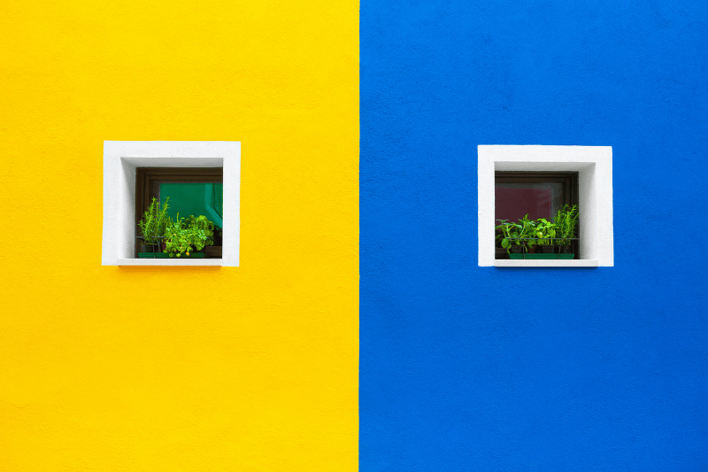
Color contrast is one of the frequently used implementations of contrast in design. Clear color differences help create visual focus, improve readability, and strengthen hierarchy, allowing for optimal information delivery.
Here is why color difference becomes one of the most frequently used implementations:
Large elements naturally attract attention faster than smaller elements. In the context of contrast in design, size and scale differences are the tools used to show information priority. This technique is ideal for making headlines, call-to-action (CTAs), and other focal elements immediately readable. Moreover, it also serves as the focus of the audience’s attention, as well as clarifying the visual hierarchy in a design.
Typography contrast has an important role in creating structure and visual hierarchy in design. Different font styles help audiences distinguish between main and supporting information more quickly, making the text easier to read and understand.
Letter weight difference provides a highlight for important information. For example, titles or keywords use bold fonts, while the body text uses light or regular fonts to ensure readability.
The use of serif and sans serif fonts creates contrast for visual characters. For example, use a serif font for the headline to give a formal and firm impression, while using a sans serif for the body text so that it feels more modern and cleaner.
Designers often use uppercase letters for headlines or labels to look stronger and stand out, while a lowercase or capital letter in front of the sentence in the body text functions to maintain readability.
Contrast in shape and visual style comes from the differences in character between design elements, such as the difference between geometric and organic shapes or between sharp and rounded corners. These differences help create clear visual separation while adding dynamics to the design’s appearance. For example, geometric shapes with sharp corners can convey a bold and modern feel, while organic shapes or rounded corners create a soft and welcoming feel. The combination of the two creates a design that feels more vibrant, balanced, and appealing to the eye.
Contrast in texture and detail comes from the differences in the characteristics of visual surfaces, such as the difference between rough and smooth textures or complex and minimalist details. These differences can add visual depth and enrich design character without adding many elements. For example, a smooth-textured background combined with a clean, minimalist main element can highlight the focus as well as create a more layered and visually appealing look.
Contrast levels in design are generally divided into high and low contrasts. Depending on its intended use, each contrast has different characteristics, functions, and visual impacts.
High contrast has a sharp and strong look, making it effective to immediately attract the audience’s attention. This approach is perfect for headlines, posters, or call-to-action (CTAs) that need high visual focus.
On the other hand, low contrast provides visual differences that look soft and subtle, giving a calm, elegant, and refined impression. This type of contrast is suitable for editorial designs, luxury branding, or as a background to maintain visual comfort.
Therefore, the use of contrast needs to be adjusted with context: high contrast to create focus and low contrast to build design atmosphere.
Contrast in design affects how the brain processes visual information and determines where the audience’s attention is directed. A proper contrast implementation can improve readability while helping the audience focus on the most important elements.
High contrast tends to convey an energetic, dramatic, and bold impression, making it effective to attract attention quickly and emphasize key messages. On the other hand, low contrast conveys an elegant, soft, and refined impression, creating a calmer and more comfortable visual atmosphere.
With acknowledging the psychological impact of contrast, designers can control the audience’s emotion, perception, and response strategically in line with the design’s goal.
Contrast has an important role in ensuring a logo’s clarity and readability in various sizes and media, from billboard to favicon. Color, shape, or weight differences help maintain visual identity consistently and recognizably. With proper contrast, the logo is effective to convey brand identity even though it is displayed in a small size or viewed from a distance.
In editorial and poster layouts, contrast plays a crucial role in graphic design, helping readers scan information quickly and comfortably. Differences in sizes, colors, and visual weight create a hierarchy that guides the eye to the most important information first. With the right contrast, headings, subheadings, and supporting content can be distinguished clearly, making the reading flow feel more structured and easier to understand.

In UI/UX and digital design, contrast is an essential design principle for creating inclusive and friendly user experiences. Proper contrast can improve accessibility, readability, and navigation clarity in digital interfaces. Additionally, the Web Content Accessibility Guidelines (WCAG) also emphasizes the importance of color contrast for ensuring digital content is comfortably accessible to all users, including those with visual impairments.
In branding and visual identity design, the proper implementation of contrast plays a crucial role in building and emphasizing a brand’s character. Contrast helps establish and emphasize a brand’s character, whether it’s bold and expressive, modern and dynamic, elegant and premium, or minimalist and clean. Thus, through consistent differences in colors, typography, shapes, and visual styles, contrast ensures a brand’s identity is easily recognized and leaves a strong impression on the audience.
The improper use of contrast in design can decrease visual clarity and disturb the information delivery. Here are some of the common mistakes of improper contrast implementation that will help designers avoid errors to create a design that is more effective and comfortable to see.
Even when using a low-contrast style, color differences should still be considered. If the visual differences between elements, such as color, size, or thickness, are inadequate, the elements will appear to blend. As a result, this weakens the visual hierarchy, reduces the readability, and makes it difficult for the audience to grasp key information.
Excessive contrast in design occurs when all elements use the same strong contrast without any variation in low contrast. This condition creates an aggressive appearance, strains the eyes, and distracts focus, making it difficult for the audience to recognize the most important information.
Contrast that is implemented without a specific pattern can confuse the audience, damage visual hierarchy, and weaken the overall design structure.
Contrast in design is the main tool to clarify hierarchy and convey information effectively. Without contrast, design is difficult to understand and doesn’t have a clear focus. As a result, contrast should be used properly, enough to differentiate each element but still look neat and visually blended. Moreover, with the right understanding, contrast makes a design look more attractive, communicative, and meaningful.
Want to improve the quality of your designs? Learn more about design principles and practical tips for creating visuals that really stand out.
