Line is the most fundamental and commonly utilized visual element in design. In actuality, a line in design is more than just a doodle or boundary marker. It serves as the foundation for the structure’s basic composition. Almost all visual work, from graphic design and illustration to interface design, employs lines to provide direction, relationship, and regularity.
Line is an element of design that connects all other visual aspects, such as shapes, colors, and textures. Designers can use lines to create space, boundaries, and direction for their audience. Despite seeming simple, decisions concerning thickness, direction, and line style can influence how the viewer interprets the design.
Thus, to grasp the role of a line in design, one must consider its types and effects on visual perception and compositional structure. Understanding this principle enables designers to make more organized visual decisions before moving on to other elements.
Table of Contents
A line in design context, line is a visual path that connects two or more points, be it explicitly or implicitly.
Lines do not always appear as straight, stretched visual lines; they can also be implied by color contrasts, object direction, or the arrangement of parts that generate a specific visual flow. Lines are thus more than just a cosmetic element; they also serve as a decorative element.
As has been explained previously, line plays a role in visually forming boundaries and directions and connecting each element. Lines can separate areas, emphasize objects, or direct the audience’s reading flow in a design.
In addition, it is critical to distinguish between explicit and implied lines. An explicit line is one that is plainly visible, as an outline, divider, or stroke. Meanwhile, an implied line arises indirectly, such as by the direction of an object’s attention, the arrangement of consecutive elements, or contrast differences that create a visual trail. Both are equally significant in determining the structure and flow of the design.
A line in design can appear in various shapes and characters. Each type of line has a different visual impression, making its use affect the structure and emotion of the overall design. Understanding types of lines helps designers choose the most suitable visual approach that is in line with the design’s purpose.
A horizontal line is a straight, flat line that runs parallel to the eye’s line of sight. This type of line is often used to create a sense of stability, calmness, and structure. In visual composition, horizontal lines are frequently used as area dividers or as the basis for a neat and easy-to-read layout.
A vertical line stands upright and tends to give a strong, formal, and solid impression, like a pillar. These lines are often used to emphasize structure, hierarchy, or a professional impression. In layout design, vertical lines also help divide columns and direct attention regularly from top to bottom.
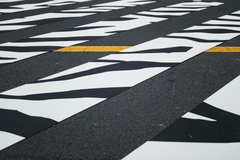
A diagonal line is an upright but slanted line that connects two corners between horizontal or vertical lines. The diagonal line creates a dynamic and moving impression in a visual composition because its position is not parallel to the natural line of sight in the eye.
A curved line has a smoother and more organic character. This type of line is often associated with a flowy, natural, and humane impression. In a design context, a curved line can reduce a rigid impression and soften the visual structure that tends to be too geometrical.
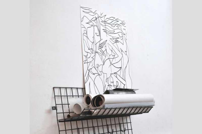
This type of line is free and unorganized, resembling the natural shapes found in organic forms. Organic lines are used in illustration and expressive or visual designs that wish to show spontaneous and flexible character.
The last one is an implied line, which is not depicted in actual existence but rather by the arrangement of visual elements, perspectives, or contrasts. Although these lines are not explicitly displayed, they play an important function in determining the visual flow of a design, especially for the viewers.
A line in design plays the role of a structural tool in building visual regularity. Through placement and management of lines, designers are able to organize how to connect, separate, or read elements in the right sequence. The following functions show the key role of lines in shaping a clear visual structure:
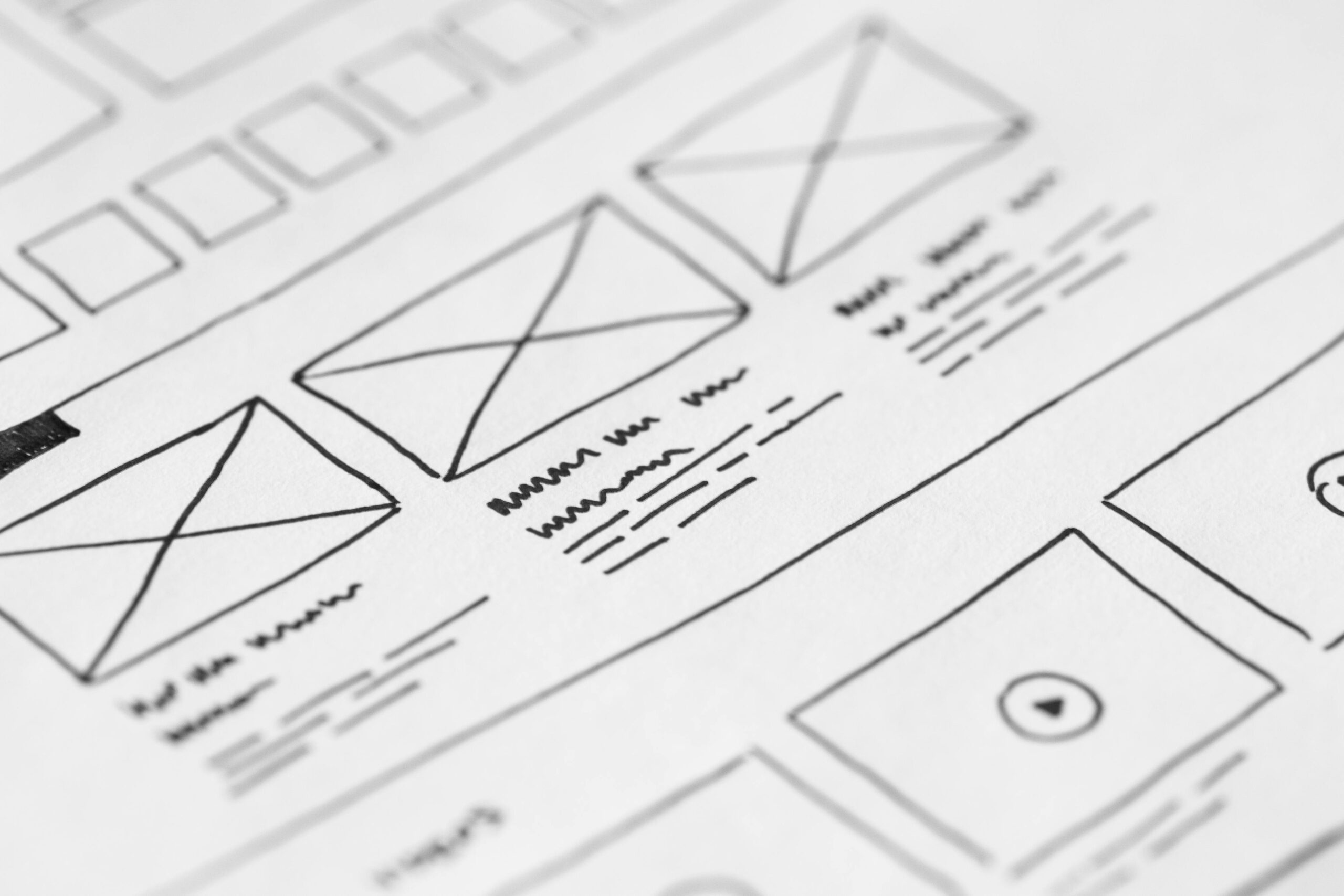
Lines form the initial framework of a composition by emphasizing the boundaries of areas and the contours of objects. Outlines, frames, or borders are boundary lines that help with visual structure, clarifying hierarchy and preventing elements from overlapping. This structure becomes the foundation before other elements like color or texture are added.
Lines are often used to divide rooms into more organized parts. Horizontal or vertical dividers separate the main content from the supporting ones, making it easier to scan information and understand it without excessive visual markers.
Lines clearly demonstrate the visual relationships among elements. The connecting lines, arrows, or thin paths help the audience understand the connection to each piece of information, especially in diagrams, infographics, or navigation systems.
The repetition of lines with specific spacing or size creates an initial visual rhythm. This rhythm provides order and consistency and becomes a foundation before more advanced principles, such as rhythm and movement, are applied in a more complex manner.
A line in design can affect the way our eyes read a composition. Humans’ eyes tend to follow the clearest visual path, so the direction and placement of lines can guide attention naturally without direct instruction.
Horizontal and vertical lines are relatively easy for eyes to follow, as they are harmonious with common visual perception. On the other hand, diagonal and curved lines direct the gaze along non-straight paths, creating a more active and dynamic visual impression. This difference in direction makes lines an important tool for regulating focus and the sequence of viewing.
Besides those lines, implied lines can also create a visual flow. The management of elements or differences in contrast can intuitively guide viewers’ eyes. With this approach, designers can direct attention without using explicit lines, allowing the design to remain clean and controlled.
Lines are not only a visual element but also a part of the strategy of building brand identity. The characteristics of a line in design, including thicknesses, directions, and styles, can affect how the audience perceives a brand. They help the audience feel whether a brand looks solid, elegant, modern, or expressive.
Clean and thin lines are often used to show minimalist, elegant, and precise impressions. Meanwhile, bold and rough lines tend to give off a sense of strength, boldness, and expressiveness. The consistency in using lines helps a brand build a visual identity that is easily recognizable in various media.
In a brand’s visual system, lines are often applied as a consistent supporting element, including as a divider, frame, grid, or graphic accent. This role helps in maintaining visual regularity as well as strengthening the overall design look in various applications, starting from logos to digital promotion materials.
To make them effective, the use of lines in branding needs to be properly arranged by the right design principle. Lines should support balance, hierarchy, and visual clarity, not just be a mere decoration. To learn more about the relationship between visual elements and their implementation, you can read the article “Principle of Design.”
Some common mistakes in design involving lines are not technical errors; instead, they result from a lack of consideration for context and visual purpose. Here are some common mistakes designers often make:
Lines that are either too thick, too many, or too contrasting will defeat the main element of the design. Therefore, instead of helping the structure, they distract and ruin the visual hierarchy.
Combining thick, thin, straight, and organic lines without any rules will make a design appear messy. Without consistency, lines will lose their roles as a binding element, and instead, they will weaken the visual unity.
Using a line in design without any structural function or proper visual flow tends to be overall useless. In this case, lines are only used as a mere decoration and therefore do not add any value to the readability or visual flow.
Lines that are placed without considering the focal point will direct the gaze toward unimportant areas. This is a mistake that will make a design feel confusing because the visual flow is not controlled.
Lines are the most fundamental visual element that shapes the initial structure in a design. Through lines, designers can arrange the relationship between each element and control the visual flow and regularity from the beginning. Despite looking simple, decisions regarding direction, boldness, and line style can have a significant impact on the clarity of the information a design wishes to convey.
The effectiveness of a line in design is determined not only by its existence but also by how well it is implemented in accordance with visual design principles. Proper implementation of lines will be a good design foundation that supports the overall visual hierarchy, rhythm, and consistency.

