Hierarchy in design is a fundamental principle that needs to be understood by designers to arrange the visual priority in layout designs, making the audience understand the message clearly. Moreover, hierarchy determines which visuals will be seen first so that the information flow can be understood in a gradual and structured manner.
Without paying attention to hierarchy theory, a design will feel plain, lack focus, and make it difficult for the audience to understand the information. In addition, essential information can be missed, preventing the main message from being conveyed effectively. Therefore, hierarchy in design is a key to ensuring visuals are not only aesthetically appealing but also serve as a clear and targeted communication medium.
This article will discuss the importance of hierarchy in design needs. Its key roles include shaping the audience’s attention span, enhancing the clarity and readability of messages, and organizing the arrangement of other design elements.
Table of Contents

Hierarchy in design is a visual element categorization principle that determines the audience’s attention flow, making the messages understandable logically, clearly, and effectively. In practice, hierarchy in design includes information and visual hierarchy. The hierarchy of information manages content structure and priority, while visual hierarchy translates the structure into an appearance that is understandable for the audience.
The two aspects of hierarchy mentioned above complement each other and contribute to the overall principles of the design framework. Within this framework, hierarchy works together with other principles like balance, contrast, proportion, and unity to form a clear and consistent visual system, as discussed further in the Principles of Design article.
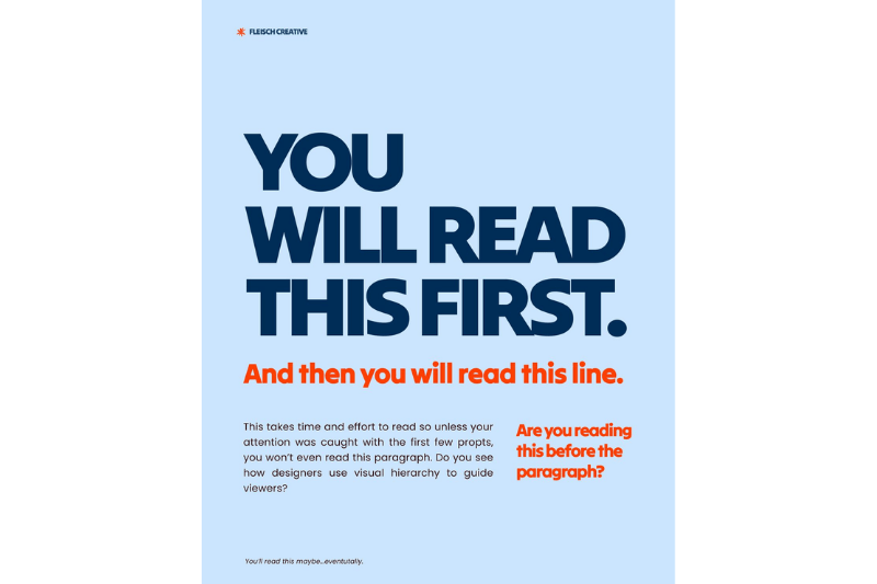
Hierarchy in design helps direct the audience’s attention flow by deciding on the main element as the initial focus, followed by other supporting elements. By establishing proper visual priorities, designers can help the audience naturally understand the context and the intended message.
Additionally, hierarchy in design has an important role in increasing the readability of information. The size, contrast, and elements’ position help the audience differentiate the main and supporting information, making the content more understandable.
Furthermore, hierarchy in design works as a visual storyteller. The structured elements allow designs to deliver messages and create an emotional closeness to the audience.
Before understanding the technical implementation, it is important to note that hierarchy in design is not instantly created. Hierarchy happens through the combination of several visual aspects that support each other and work together. Here are some visual aspects you need to know:
Size and scale are crucial in determining the priorities of visual elements. An element with a larger size tends to attract attention before smaller elements, so it is often used to emphasize the main information in the design.
Color and contrast help create visual emphasis. The color difference that stands out, or high contrast, makes certain elements easy to recognize and distinguish, giving a clear hierarchy in design.
Typography provides font weight, letter style, and text size variations. By emphasizing letter weight, size, and even different font styles, it can strengthen the emphasis of the information and help the audience recognize the structure of the content more quickly.
Spacing and position determine how to categorize and prioritize elements. Elements that have a strategic position or are given a wider space tend to be perceived as more important. As a result, the visual position has a direct influence on the order of the audience’s attention.
Hierarchy in typography helps designers manage texts to make them easier to read and understand. Its basic structure consists of a heading, a subheading, and body text. The heading provides the main information. The subheading works as an explainer or connector between parts. Meanwhile, the body text provides a detailed explanation of the information.
Additionally, hierarchy in typography is based on font weight and style. The use of bolder letters, bigger sizes, or different styles helps affirm the level of information priority. These differences make it easier for readers to understand which information should be read first.
Moreover, the consistency of hierarchy in typography is crucial for newbie designers to ease them into planning a clearer information structure, maintaining visual focus, and comforting them when reading it.
Layout and composition are crucial for building design hierarchy through the management of arrangement, distance, and relation among visual elements so that the information can be received in a structured manner. In editorial and poster layouts, hierarchy in design is implemented through the arrangement of titles, subtitles, images, and supporting texts. The primary elements are given stronger visual emphasis through size, position, or contrast to attract attention easily, while supporting elements are arranged to clarify the main message.
On the other hand, in the context of UI/UX and digital design, hierarchy helps users understand content priorities and interface functions. The arrangement of size, color, distance, and position guide users in interacting intuitively and efficiently.
Moreover, hierarchy in design has a close relationship with visual flow. Thus, proper implementation of hierarchy creates a clear visual flow and guides the audience’s eye movement naturally from one to another. As a result, the visual experience feels more structured and easier to understand.
Structurally, hierarchy provides a framework that manages the relationship between visual elements in a design composition. Each element doesn’t stand alone but rather supports the others to form a consistent and logical sequence of attention. This structure helps guide the audience’s eye from the most important information to supporting information gradually. Thus, it prevents the visual display from feeling random.
Understanding every visual element’s role in creating a design structure becomes an important aspect in the implementation of an effective hierarchy. With proper element implementation, each visual component can function according to its level of importance and form a complete composition, as explained further in the article Elements of Design.
In practice, hierarchy implementation in design isn’t always done properly. Errors in visual hierarchy arrangement can hinder the clear delivery of the main message. Therefore, the understanding of common mistakes in hierarchy implementation becomes crucial so that designs can be arranged consistently and in a directed manner.
This mistake arises when there is no clear visual difference between the main and supporting elements. As a result, designs lost their focus, making the audience have trouble recognizing the most important information.
Designers use too many levels of hierarchy, making a complex information structure. Thus, this condition can confuse the audience and reduce the effectiveness of visual message delivery.
The inconsistency in size, color, or style for the same function can disturb readability. Therefore, it ruins the attention flow and makes the visual structure difficult to understand.
Hierarchy is the main foundation in planning a design that functions to organize the sequence of attention so that information is conveyed clearly and in a structured manner. Hierarchy implementation in typography, layout, and other design elements helps create message clarity and increases the effectiveness of visual communication.
For visual order to function optimally, each level of information should be supported by visible differences, such as size, color, and visual emphasis. Use these factors to make sure your visual designs effectively convey the information.


