When seeing a design, our eyes are not just “seeing” but also moving along with the patterns that look like they were previously prepared. Theoretically, rhythm and movement in design cannot be physically seen. Rather, this theory emphasizes that visual effects can appear because of certain repetitions of elements that are arranged meticulously, creating a natural visual flow.
In practice, rhythm and movement in design cannot exist alone. This approach aligns with hierarchy and contrast, both of which are basic principles of visual design. Hierarchy controls the flow of information, contrast highlights visual differences, and rhythm and movement add life to the design. Without rhythm and movement, a design may appear clean, but it will be excessively static and less engaging.
This article is a deeper explanation of the article “Elements of Design: Core Visual Principles Every Designer Must Master.” The main focus of this article is to learn how rhythm and movement in design will create an orderly reading flow.
Table of Contents
In design, rhythm refers to a recurring pattern of a visual element that generates regularity. This pattern allows the audience’s eyes to become comfortable with particular patterns, giving the impression of a constant and structured design.
The main function of rhythm is to maintain visual consistency. When a certain element has a recurring pattern, our eyes will feel “comfortable” in seeing it. This will enhance the visual’s neatness and make information easily delivered. Rhythm like this will make a design easier to comprehend and not messy.
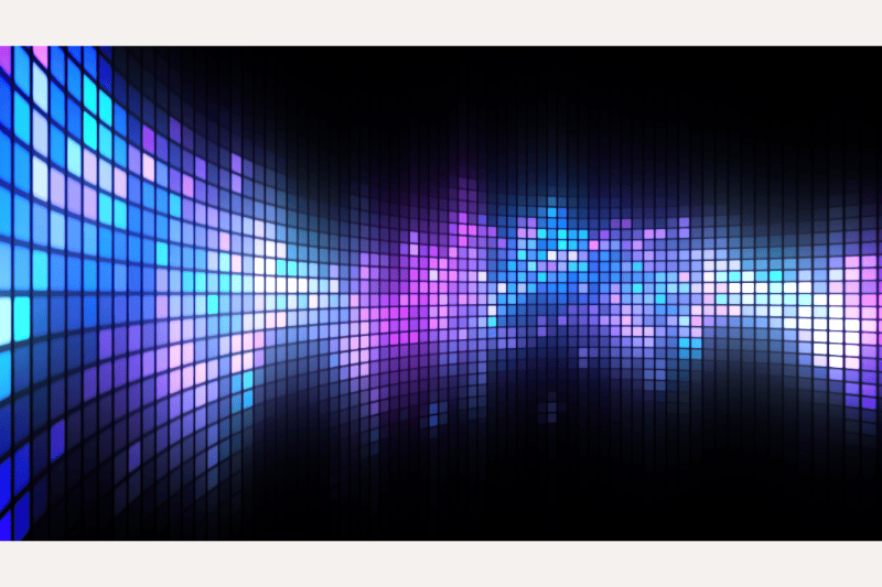
Rhythm can be established using various design elements, including size, color, shape, and spacing. Some examples of rhythm in design are headings with the same spacing, icons with consistent sizes, and the constant use of the color tones.
In design, rhythm has several recurring patterns that function to manage regularity, visual flow, and visual consistency in a design.
Regular rhythm is a recurring pattern of a stable and consistent element with the same spacing, size, and shape. This type of rhythm is commonly used in grids, tables, and formal layouts to emphasize regularity.
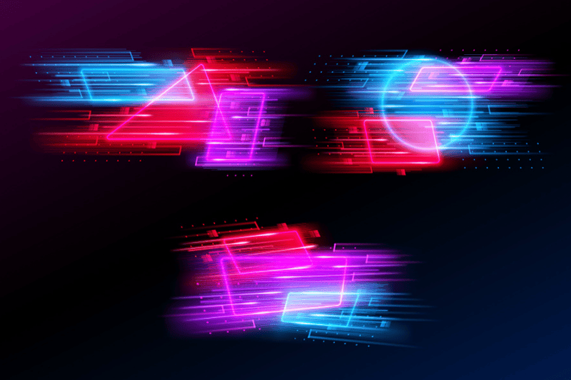
Alternating rhythm uses a back-and-forth pattern, such as changes in color, size, and shape of elements. This rhythm creates visual variety without disrupting the balance and order of the design.
Progressive rhythm is a recurring pattern that shows gradual, slow changes. For instance, the size of elements may gradually increase, or the spacing may gradually tighten. This type of rhythm is effective for building a certain emphasis and visual direction.
Random rhythm demonstrates a more free-form, yet still controlled recurrence. Despite appearing random, these visual elements appear unified due to their same style, color, or character, ensuring the entire design’s coherence.
In design, movement refers to the sense of the direction in which an audience’s eyes move when viewing a visual composition. Design is fundamentally static, yet the arrangement of visual elements causes the eye to be “drawn” from one location to another.
In the context of rhythm and movement in design, movement is the one that directs attention. The visual elements work together to create a clear and controlled visual flow, allowing the audience to gradually comprehend information without any confusion.
Some main factors that create movement are:
The main objective of movement is to guide attention. With good design movement, designers can naturally draw the audience’s attention to the most relevant information without the need for explicit direction.
Rhythm and movement are strongly related to each other in design practice. Rhythm generates a visual flow through recurring patterns, whereas movement encourages the eye to actively follow that flow.
All in all, we can say that the right movement strengthens a design’s rhythm. When eyes move following a certain direction, the recurring patterns will feel livelier and more meaningful. On the other hand, rhythm without movement will only be a static visual decoration.
Rhythm and movement in design are basically one system that creates a visual flow. Both rhythm and movement create a natural flow, making the design appear fluid and easy for the audience to understand.
Rhythm and Movement in Layout and Composition
In editorial layouts, rhythm and movement help readers move from the title and subtitles to the body text with a clear flow and orderly manner. Grids, margins, and the repetition of typography play an important role in creating a comfortable reading experience.
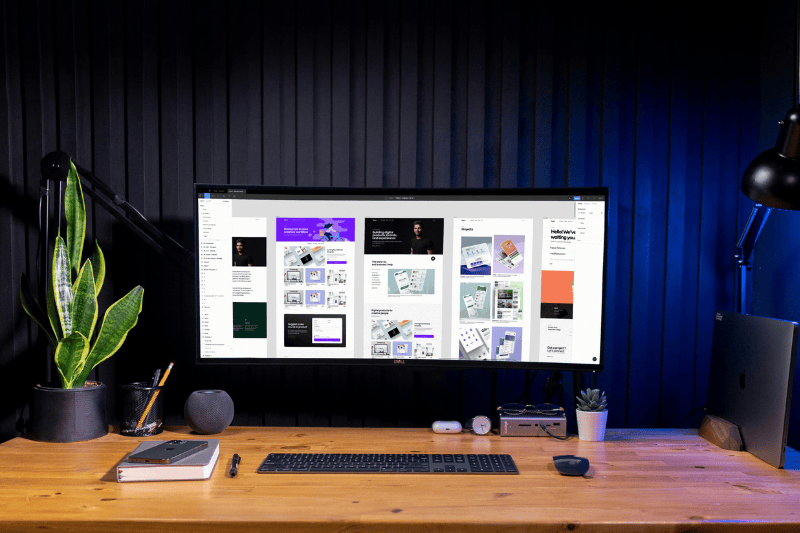
Rhythm and movement in design, especially in UI/UX, include the sensation of scrolling, navigation, and the placement of CTAs. Aside from that, recurrent card patterns, regular spacing, and clear visual direction assist visitors in understanding the site layout quickly and intuitively. As a result, the visual flow feels natural, more focused, and not confusing.
As previously said, rhythm and movement in design influence the visual flow, comfort, and psychological responses of the audience. The proper usage of them makes a design feel dynamic and easy to comprehend, whereas the incorrect application causes a lack of focus and weakens the visual messaging. The following are some psychological effects and common mistakes while developing rhythm and movement in design:
A uniform rhythm with little variation will make a design appear overly plain and dull. This circumstance can limit the audience’s interest because the eyes do not receive enough visual stimulation to follow the design.
Excessive movement or a lack of clear visual direction can lead to eye strain. The audience becomes confused about where to look because the visual elements compete for attention.
Repetition of elements created with an uncertain purpose will just serve as decoration. This type of rhythm fails to create a visual structure, preventing the viewer from focusing on the main feature.
When the direction of movement is unclear, the audience struggles to understand the visual hierarchy. As a result, the design fails to optimally deliver the main design message.
The balance between rhythm and movement creates a design that is lively, dynamic, and still comfortable to look at. The visual flow becomes clear, focus is easily captured, and the overall user experience is enhanced.
Rhythm and movement in design are fundamental components of design concepts that contribute significantly to the creation of an efficient visual flow. Dynamics that increase the design’s communicativeness introduce both perfect hierarchy and contrast.
Rhythm and movement do not function independently but rather as part of a larger system of visual principles. Designers can produce visual works that are not only aesthetically beautiful but also successful at communicating a message if they grasp and apply rhythm and movement in design effectively.
